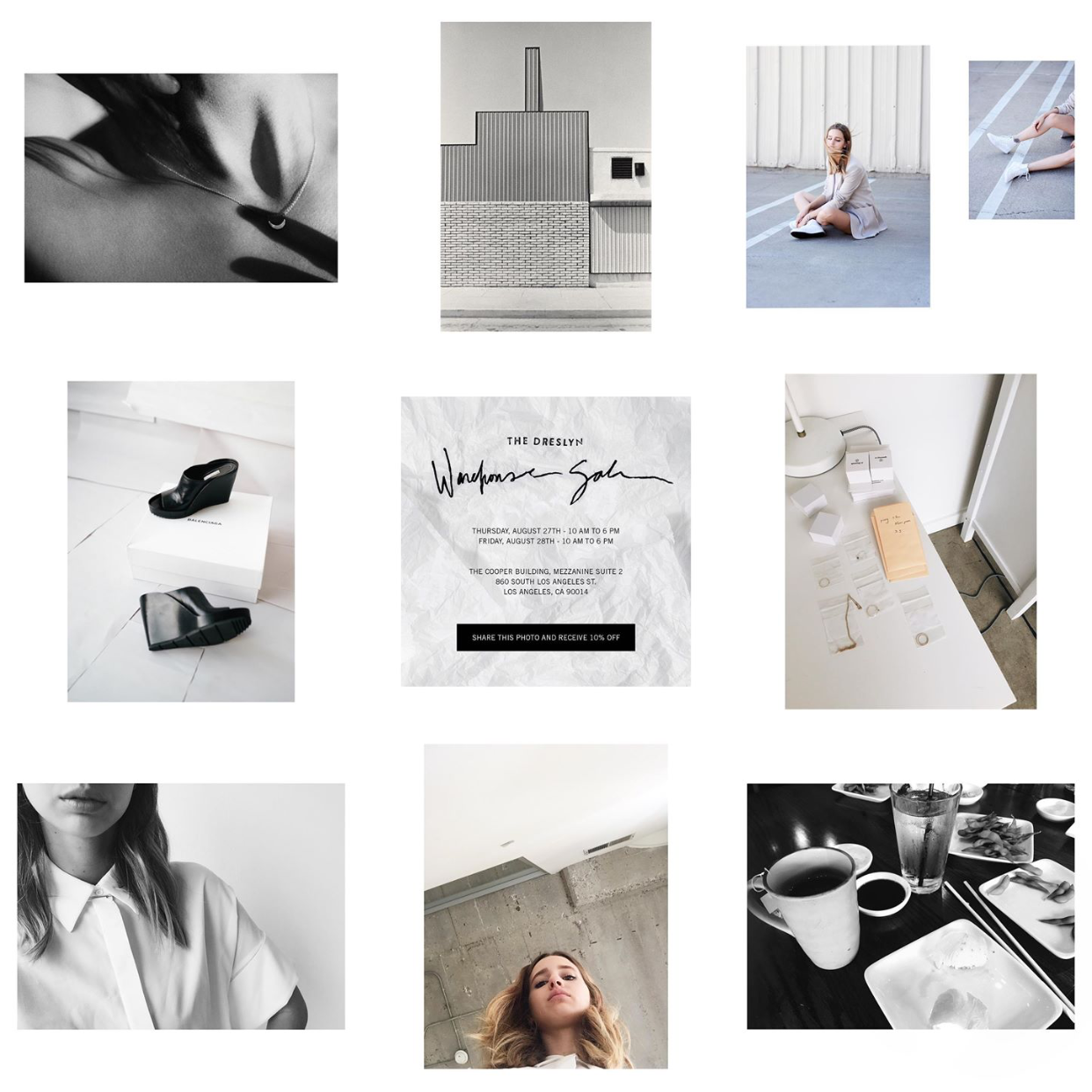
For a lot of us, Instagram can be our weapon of choice when it comes to dominating the social media game. Unlike Twitter and Facebook, it is one of the social media channels where you can express yourself or your brand creatively and really put best foot forward when it comes to building a great aesthetic.
To gather a bit of inspiration, we end up following some amazing Instagrammers in hopes of following their creative footsteps, but how do some brands and Instagrammers maintain some of the freshest looking feeds that you can scroll through forever? We've taken some notes from some of our favorite Instagrammers, and took note at what really makes a perfectly-produced Instagram.
Choose Your Floor
This is your foundation and your destination. Where do you want to be in your post? A minimalistic warehouse with concrete floors? A 5 star hotel bathroom with marble counters? A coffee shop with beautiful blue tile? Keep your eyes peeled on the floor because that can be one of the best assets to your photo when shooting from above.
Add Texture
Have a variety of textures and fabrics on hand to add dimension - be it fur (or faux-fur) , turkish towels, decorative pillows, lace...the list goes on. For food styling, feel free to scatter a few crumbs around the food to make it feel more natural, and adding some dish towels or utensils helps too! Don't be afraid to get messy!
Lighting Is Key
Lighting is by far the most important aspect of your photo. Always shoot your subject near a window, door, or even outside where there is an abundance of natural light. Sometimes, it helps to crawl to the corners of the house below the windows to get the best lit areas. And for the best lighting during the day? Make sure to take advantage of the golden hour before sunset for some of the dreamiest natural lighting.
Give some props to your props
Throw in some plants, leaves, gems, magazines, candles, etc.. It always pays to stock up on trendy Instagrammable props to make your feed more beautifully composed. Plus, more props means more stuff to add to an amazing flatlay!
Use your iPhone's focus
By holding your finger down on the screen until a white box appears. Use this to center in on a focal point. Then slide your finger up and down to adjust the exposure (hint - it's easier to correct over exposed photos than underexposed).
Landscape vs. square photo
If you want your feed to be consistent, make sure to either stick to filling the entire square on your posts, or doing landscape with white borders on the top and bottom. Whatever you choose, make sure it looks thoughtfully planned out and composed, and not like you just threw up a photo on your feed because you had to. (Patterns are key!) However, with Instagram's amazing new update released this week: you can post landscape photos without it ruining your entire feed if you use the entire frame! Huzzah!
Color Palette
Some of the best Instagram feeds done an impeccable job at using the same color palatte, and not having any off-theme colors throw off their feed. Sticking to two to three dominant colors on your feed will make your Instagram much more alluring, which will definitely rack in the likes and the follows from people who will be inspired by your feed.


