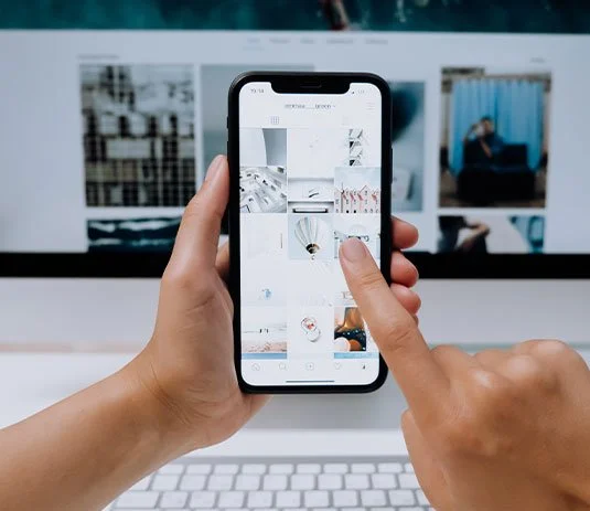
Building a brand is like building a home. You need a great foundation. The right tools. Someone who knows what they're doing...
As avid Squarespace users ourselves (seriously, shoutout to the platform that makes our blogging lives the best!), we wanted to know how these three creatives chose and best utilize the platform.
A fashion blogger slash entrepreneur. A food stylist. And a designer. They all picked the same platform. By chance? Not at chance. Scroll through to see why these successful women all designed their sites with Squarespace, why, and what they're doing in the biz world.
photo credit: Tyler Topacio photography via Profresh Style
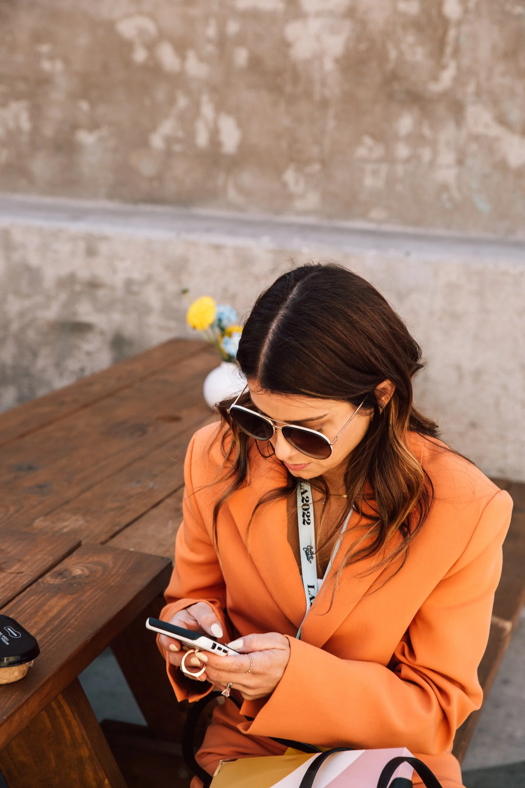
CHRISTINA TOPACIO, FOUNDER PROFRESH STYLE
Like many fashion bloggers, Christina Topacio started her blog in 2008 with a desire to express herself. The ultimate goal was to land a coveted job in the fashion industry. But what she created was so much more than a job.
With a growing fan base and a new creative venture, JIG + SAW, we caught up with the OG blogger to see why Squarespace is the space for her.
Why did you choose Squarespace as your blog platform? And why does the layout you use work for your brand?
Squarespace just works for me. Since Myspace days, you kind of teach yourself to code and it gets so time-consuming. For me, I wanted to think more about the content of the site rather than all the many design elements to be coded and placed. Squarespace gives me the ability to be unique and caters to exactly what I want my readers to engage with. The layout, Horizon, was perfect because it allowed my photos to shine while not overshadowing my written word. I literally sound like an advertisement but I'm not kidding when I say, Squarespace is the sh*t.
What design advice do you have for those putting together a site now?
Think about what you want people to be attracted to first and foremost, almost like, the first impression rose (cue The Bachelor). I knew I wanted people to know about me and why I started this blog and what else I'm working on. I made sure that was the focal point. If your blog is your main priority, ensure you choose a layout that works for that. If it's your beautiful photography, make sure the layout highlights large-scale imagery. Just think about how you want people to view you/your work/your services. You only get about 5 seconds of their attention before they choose to leave... or stay.
"You only get about 5 seconds before they choose to leave... or stay."
Tweet this.
Why do you have the option to “read in traditional mode?” Options, options, options?
Ohhh, good one. Back in the day (2008, heyyy!), content was read like an infinite scroll, reading blog post after blog post, without the need to click to view. After making marketing my profession, I learned about CTR and its importance and thus, the index view. Higher CTR, higher pageviews. HOWEVER, I also realized after activating that, some wanted to view in that typical blogger mode, where you scroll and scroll to read more + more. Thus, the traditional mode was made. Both are important and they cater to the users' experience. I wanted to captivate both.
Let’s chat JIG + SAW for a minute. Why after years of blogging was it time to expand your offering?
JIG+SAW was born out of the idea that there are all these creatives, and what felt like, no place for us to go. JIG+SAW offers that live component of engaging on daily basis, with hopes to make something great together in the form of a cowork space. And, we also offer specialized services for young + growing businesses looking to expand in customer acquisition and brand awareness. The two business ideas go hand in hand at JIG+SAW and I can't wait to grow it. The blog will remain as its own little archive for the readers its cultivated over the years but I have so much more to do and say and create with others. And that needed another outlet outside of the blog, that still involved all the wonderful creatives + brands I've met and will meet over the next, coming years.
What has been the most rewarding part of doing both?
I love the idea that blogging doesn't just stop at blogging. It cultivates (hey, hey!) ample opportunities beyond your little space on the web. So many friends have gone off to become creative directors, designers, consultants, entrepreneurs and all because of their blog's start. Profresh Style was a place to call my own when my friends didn't understand my love for fashion. It's grown into a community, sharing our vulnerabilities and growth with one another. My readers helped me gain enough courage to chase after the things that were important to me - that connection is irreplaceable. To be understood and accepted, it can't get any better than that.
MEGAN, FOUNDER APPRVL NYC
Megan Mussari launched Apprvl in the spring of 2014. With a background in fashion and textiles, she knew that she wanted to create products that were unique, crafted with "intrinsic personality." Blending the Japanese art of Shibori with the aesthetics of curated vintage pieces, she's found her calling.
2016 proved to be her biggest year yet, with collaborations with Nordstrom, and stockists from the west cost to Tokyo carrying her goods.
Megan says her brand is made for the curious, so naturally, we had questions.
Can you tell us a little bit about yourself and how you developed your business?
I have always been a doer. I'm 26 and feel extremely fulfilled that I get to physically make products everyday to share with my customers. My business began developing when I was 23 and had a few years of fashion design industry experience under my belt and felt very very bored, and disgruntled. I was dying synthetic fabrics with synthetic dyes for a larger fashion brand to make their showroom samples, and couldn't help but think there has to be a more environmentally friendly way to work with color. In that same job I saw a lot of fabric being thrown away and barely being donated or re-purposed. I would try to save as much as possible and would carry overflowing bags of lace and silk over to FIT to donate to their design program. I began to learn the basics of natural dyes, starting with the gateway dye of Indigo, working with unwanted textiles to create more modern pieces that I wanted in my home. I eventually had a few commissioned works of throw pillows, blankets and wall hangings which led to a my first wholesale accounts!
You run the company from your artist studio in Brooklyn. Are there other people in the studio with you? What’s the design process like?
I am extremely lucky to have an awesome shared studio with my friend Alex Andrade who runs Burnin' For You Candle Co. It always smells amazing while we work, which is especially beneficial if I am working with a dye that doesn't smell that great! We have become each others official Guinea pigs on new products and ideas. We also share our studio with illustrator Matt Villaverde whose drawings are probably the only ones to make me laugh out loud.
My design process stems a lot off of what I feel is missing in my home or wardrobe, and what of those I can make from mostly second hand textiles. I also love to use materials in a way unintended for them, giving the customer a new perspective. When I create the DIY kits, I poll a lot of my friends on what they would want to learn, how it could fix a problem in their home or wardrobe, and then begin to test my instructions on them making sure everything is understandable and that they get the results they want! Our design process is very inclusive and very fun!
How do you decide on collaborations?
When I am considering collaborations I have to keep my business guidelines in mind. When I am approached I have to explain that most of the time with my work it can be a slower process. I only use natural dyes, and if the fabrics are synthetic or from animals they must be secondhand or unwanted scraps. I really like to collaborate with brands and people who have similar values and aren't just trying to make a buck, but trying to spread a message or simply make an awesome product that is beneficial in one way or another.
Your site is absolutely gorgeous. Aside from beautiful imagery, how did you decide on the design?
First I will say that Squarespace makes web design extremely available and simple for anyone to create a beautiful website. Especially for people like me who can be a little impatient with the digital age, their templates are clean and professional, and understandable to put together. I went through a few different templates in my first few months of being in business before settling on my current set up which fits my needs perfectly.
What were some key elements you wanted incorporated when you put it all together?
I needed something where I can showcase my process, have an easy to navigate e-commerce section, an event calendar and a place to blog all of my collaborations, travels and experiences through this business journey. My products and images usually have a lot going on in them, so I wanted a clean site that doesn't add to the chaos, but compliment it.
How is designing a site in any way like designing a piece?
When designing a site it has to feel 100% you, not rushed and really thought out. You design with the customer in mind. You have to edit it, make sure that everything matches whether it is the fonts, spacing, inconsistencies in your language etc.
"When designing a site it has to feel 100% you."
Tweet this.
Just like if I were to be making a blanket, pillow or bowl, you wouldn't want a mess of different colored threads or varying stitch sizes holding it all together for everyone to see.
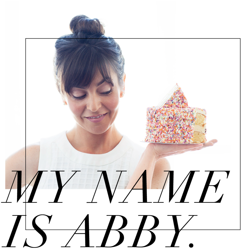
ABBY STOLFO, FOOD STYLIST
With a degree in finance and a baking story adventures of burning two batches of chocolate chip cookies, a career in food styling is not where San Francisco-Based Abby Stolofo "never would have imagined a career in food."
And yet, her good taste trumps her baking skills. Her site, the food she shoots and her career, are positively yummy. We went behind-the-scenes of Abby's brain to find out more.
Can you tell us a little bit about yourself and how you developed your business?
After a stint as a financial advisor and discovering that sales really wasn’t my jam I decided to go to culinary school. It was a comprehensive program but I really fell in love with pastry. I was living in Idaho where I’m originally from but after the program I started applying for jobs all over the country. I ended up in a well-respected restaurant in San Francisco where I did 9 months as a pastry cook before a co-worker introduced me to her neighbor, a professional food stylist. I’d never been on set before and barely had a clue what it was but it turned out to be a dream come true and the timing couldn’t have been better. Everyone in the food styling world is freelance so I’ve technically been a small business owner for over six years now. I learned food styling by assisting the very best in the industry for several years and in January of 2016 I went out on my own as an independent lead food stylist, hence my website.
Why did you get into the world of food styling?
Well, like I said, it was kind of accident. A very, very fortunate one. Now that I’m here, what I love about it is the variety. Most jobs last one to two days. Cookbook projects will last a week. Two at most. And then you’re on to the next thing. There’s a lot of problem solving involved. You’re always working in new settings with new ingredients and new recipes and each one presents a unique challenge. I love to cook and I think it’s one of the few jobs in the food world that you can actually earn a decent living from. Especially in San Francisco. I’ve gotten to travel and work with amazing brands and companies that I really admire. I also love being a small business owner. It’s the craziest most rewarding thing.
What are some behind-the-scenes tricks that you can share?
Oh gosh I’m SO glad you asked actually. I’m getting ready to share every behind-the-scenes trick I know through a series of food styling webinars and workshops made just for food and lifestyle bloggers. I’m hosting the first free webinar this month actually and was inspired by my time at Create & Cultivate Atlanta. I met so many brilliant content creators that really wanted to take their food photography to the next level but didn’t know where to begin. So, yes, all the insider food styling and photography tricks you can handle coming your way soon. Ha! In the meantime what I can tell you is that 99 percent of what you see in pictures really is food. And it’s the actual food. So often people think that what I work with isn’t actually edible and that’s not true. I don’t think I’d enjoy it if that were the case. There’s a lot of oil brushed onto things to keep them looking fresh. Lots of tweezing and water spritzing happening. If what we’re selling is ice cream it’s actually ice cream but if what we’re selling is chocolate sauce, it’s pretty likely that what’s underneath that sauce is a mixture of vegetable shortening and powdered sugar. Still technically edible ;) Most any turkey see was probably only cooked for a total of 20-30 minutes. Butter-Flavored PAM and instant mashed potatoes (for so many reasons) are in every food stylist’s kit.
Your site is absolutely gorgeous. Aside from beautiful imagery, how did you decide on the design?
Yay! Thank you so much. Well, it was a team effort actually. Ultimately I wanted something that was entirely outside of what everyone else in the industry was doing. When you’re breaking in you’ve gotta kinda make a scene, right? Like I wanted people to open it up and go, “Whoa.” And remember it. I wanted the overall feel to be light and bright and for the design to be clean, fresh, and modern. It had to be in order to showcase the images. There’s so much happening with the photography that the design had to compliment, not compete. For that reason I didn’t really integrate color into the design elements. It would have clashed with the food. I wanted a timeless logo and strong fonts that I wouldn’t tire of. I also wanted something that reflected my personality. Food styling to me is seriously the best job. It’s so much fun and I wanted a site that reflected that take. I had Pinterest mood boards and a general idea of what I wanted it to look like layout-wise but what I lacked was graphic design skills. I hired the insanely talented team at GoLiveHQ and they truly brought what I was envisioning to life. In ONE day. It was insane.
"When you’re breaking in you’ve gotta kinda make a scene, right? "
Tweet this.
What were some key elements you wanted incorporated when you put it all together?
I needed a clean, seamless way to organize and display my food photos. My absolute favorite is the sliding banner where I get to showcase some of my favorite shots. I also knew I wanted a fun headshot to round it out. I hired a photographer friend to take them and my very best girls and I had a ridiculous time in the studio one day getting literally hundreds of shots (I’m much better behind the camera.) There was cake and meringue and clothing everywhere. I always knew I wanted one long scrolling page that was easily and quickly navigated. It all just came together so perfectly and the platform was pretty much non-negotiable from the start. Squarespace is basically trendy cocktail party in the front, comfy coffee shop in the back. I absolutely love it for so many reasons, one being how intuitive it is to use which has been key to easily keeping it updated with new imagery.
How is designing a site in any way like designing a shot?
Pretty similar actually. In designing my site all of the elements really needed to work together in order to create a clear, professional brand identity and something that truly catches your eye. Designing a shot is like that too. At the start we always ask, “Okay, what is the story we are trying to tell here?” Everything is gauged against the answer to that question from the selection of props to the light to way the food is styled and presented. It has to be consistent and cohesive to tell the story. A lot of the time you only get a moment in front of your audience. The message has to be clear. Your own online brand and presence should tell a story too.
MORE FROM OUR BLOG
