I initially didn’t love the idea: an app that livestreams meditation. My boss suggested it amidst a lunchtime brainstorm, about the intersections of the wellness and technology spaces. I questioned whether live meditation really offered something different than other meditation apps. We brushed over the idea.
It wasn’t until I coincidentally began offering an optional Friday meditation to my coworkers via conference call (most of them were remote in different parts of the US) that I began to connect the dots. The real catalyst was a feeling my coworker experienced during this weekly meditation call. As she listened in and followed my voice, she noticed that her mind was not spiraling with anxious thoughts in the same way she had experienced when listening to guided meditation alone. She explained that it felt like everyone was meditating there with her in Seattle, even though the rest of the team was actually in Brooklyn, Toronto, and Walla Walla.
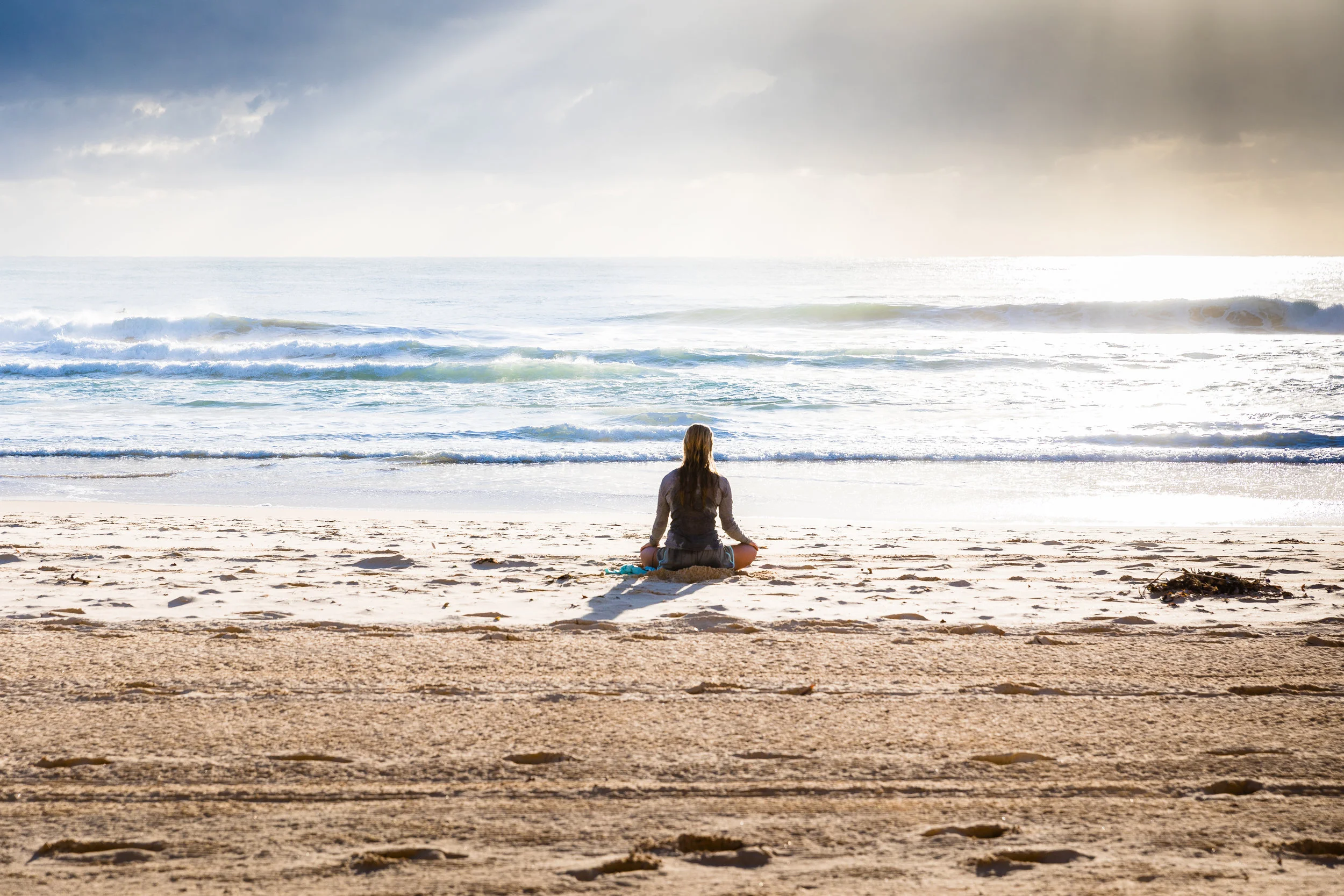
I couldn’t stop thinking about it: live meditation. Hundreds of people meditating at the same time across the world. Meditating in collective energy. I was reminded of studies that showed that group meditation has had a resonant effect on surrounding areas, reducing conflict and violence. This led me to a question that many of our great thinkers have explored: is there a single unifying force that joins us all together? And if so, can we tap into it?
I went back to my boss. Luckily, exploring and investing in this idea aligned with our company mission to start creating our own digital products again.
So, we went for it.
I kicked off the process, ushering myself through the same steps I often usher clients through: research, strategy, design, build, refinement. I was confronted with a sea of well-designed meditation apps from credible meditation experts, funded by lots of capital. There was a small opening in the market: no one was offering live meditation. We also had a unique scenario rare to the “app” world, where we were our own clients. We focused less on how to stand out, and focused our effort on what would allow an authentic manifestation of this idea.
As I began digging into design, I realized that if I continued to face the challenge of designing a meditation app, it would likely look and feel similar to other apps. In order to stand out, I needed to nurture what was unique to us. How do I help people feel the presence of others? How do I create a space in which people feel a sense of community, perhaps the presence of something “bigger” than themselves, without drawing away from the meditation practice itself? We focused less on standing out, and more on what we had to offer.
I used these questions as guard-rails. Functionality, structure, and aesthetic all had to contribute to accentuating this “feeling” of calm and the collective.
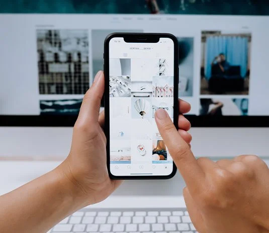
We started by stripping away anything that might distract people, or feed into our familiar behaviors of consuming content. I thought about how well-established apps (Twitter, Instagram) started, and noticed that these now refined, polished products launched with a single function. A small focused product could create big impact. We removed functionality— sign-ups, likes, comments, noted meditations— and interactions — scrolling and double taps—that weren’t 100% necessary to our experience. We landed on one single UI element: a button that allows you to Tap In and listen to a live meditation.
Our meditations wouldn’t be stored. We committed whole-heartedly to the desire to bring people together at the same time. Storing meditations would mean there would be less people sitting together daily.
We used a working prototype internally for 8 weeks prior to our beta week. During that time, we learned what being live really meant. For example, while in our internal prototype phase, I led one of our first meditations using the app from my home in Brooklyn. A man, outside my window very loudly yelled “F*** you!” It was a quintessential New York moment, but not one that was conducive to meditation. Being live meant things could go wrong: teachers could cough, a fire truck could go by, a man outside the window could yell profanities. It introduced a rawness that felt uncomfortable in a digital world that obsesses over curated experiences. We’d be removing the mask of curation, revealing our imperfections. Meditation teaches us to notice all of the facets of being human, including the environments we’re in. The more we can turn into ourselves and our breath, the more we can turn down the chaos around us. With some loose guidelines in place to ensure a relaxing experience, we chose to embrace it.
The remainder was primarily aesthetic, and relied on details and metaphors. We landed on the idea of each user being represented by a light orb, rather than photos or videos. As users “Tap In,” we could create a celestial ecosystem. With a halo identifying your own orb, you flock together and shift shapes with the other meditators. We aim to accentuate the feeling of togetherness— or at least ignite the imagination. Our backgrounds are blobs of colors, with ribbon-like shapes intersecting, visualizing what energy looks like to me. They continuously undulate and shift back and forth, up and down. We created a space that users can walk into, in hopes of immediately promoting calm.
As I reflect back on the creation experience, I noticed it’s often easier to look at other products and see value in their solution, rather than mold your own unique but raw ideas. Looking out rather than in often moves us into a space of comparison instead of creation. What is it that you are really trying to solve? And how can you share your unique take on that idea. In the creation of Tap In, solving the design for the app meant borrowing deeply from meditation traditions: silencing the noise in order to stay clear and true to the pure “essence,” the seed, the soul of the idea.
Originally from Montréal, Margaux Le Pierrès works as the design director at Fictive Kin, a digital product studio, where she had lead branding & digital product design for fabulous companies like National Geographic & Kickstarter. Margaux is also a certified Reiki Master, and Akashic record practitioner, with experience working with clients one-on-one to help facilitate opportunities for people to connect to themselves more deeply, and live a more authentic life. Along with Fictive Kin, Margaux recently launched Tap In, the first live, collective meditation app.


Missed out on Gina Bianchini’s incredible session from our Offsite? No worries! We’re sharing her insights on building a thriving community that feels like a real network, not just an audience.