Photo: Smith House Photo
Welcome to the Create & Cultivate Clubhouse! We’re so excited to finally reveal our new L.A. workspace where all the magic happens. C&C CEO, Jaclyn Johnson worked closely with interior designer Ginny Macdonald to create an office that not only reflects the unique vision, voice, and DNA of the C&C brand but also inspires and motivates its dynamic team. Ultimately, they wanted to create a collaborative working environment where people could work away from their desk or have smaller team meetings.
Designing every inch of the 5000-square-foot industrial-inspired space in downtown Los Angeles was no mean feet—the large open-plan office has a mezzanine level, three private offices, an open-plan kitchen, conference room, and two bathrooms—but as you can see, Johnson and Macdonald nailed it. The cool urban-industrial architecture style complete with exposed ceilings, double height black metal-framed windows, cinder block walls (painted white), and concrete floors was essentially a blank canvas for them both to put their stamp on.
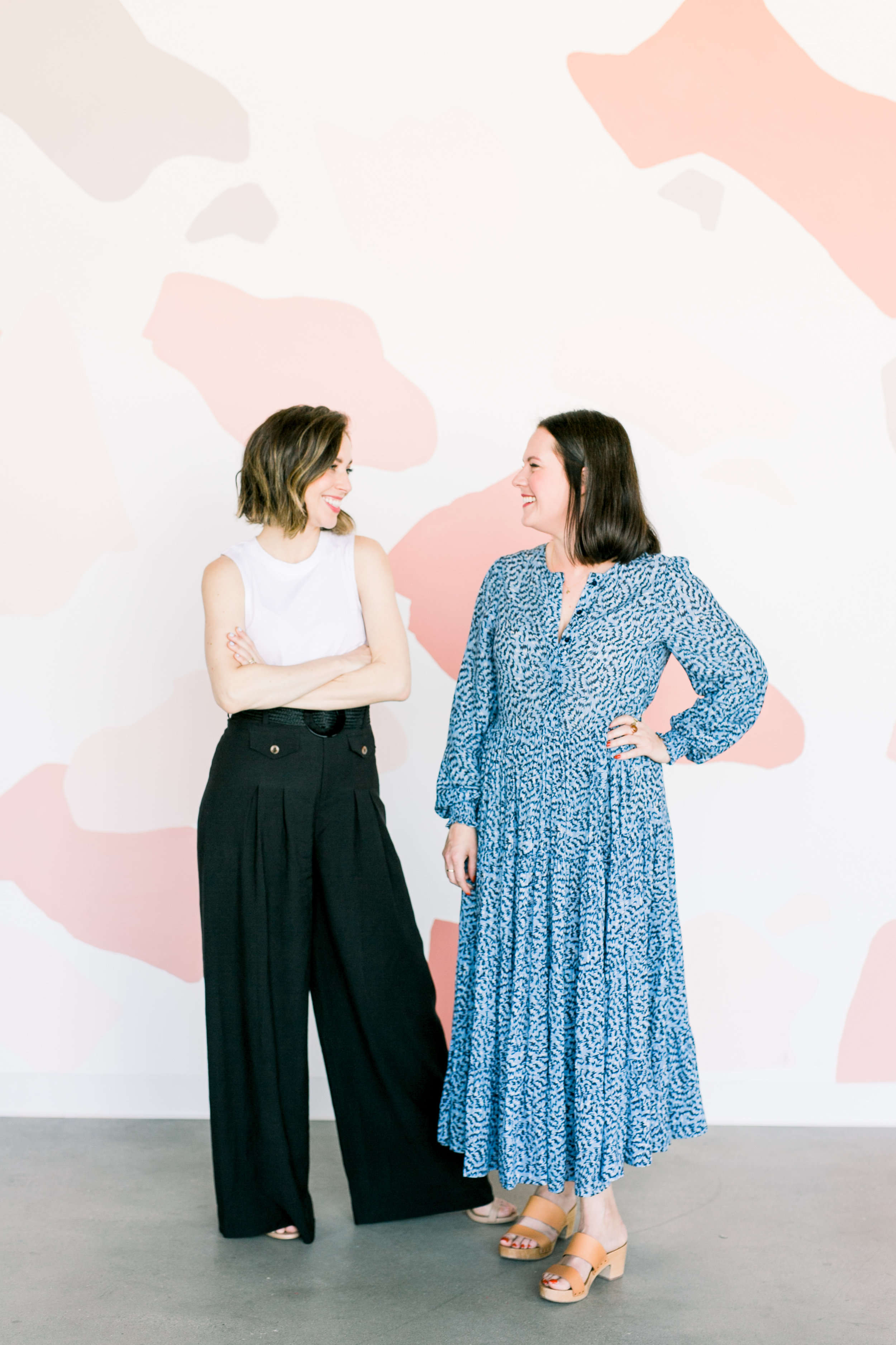
The first thing people notice upon entering the space is the color scheme. For this, Macdonald really tapped into the Create & Cultivate DNA with salmony pinks and blush tones. “Jaclyn’s husband is a super talented artist so he created two amazing wall murals,” Macdonald recalls. “The first being the terrazzo inspired wall in the lounge area where he used a mix of different shades of pink, peach and gray from Dunn Edwards. The second mural is one of C&C’s mantra’s ‘Collaboration Over Competition’ which is such an inspiring quote so it had to be big and bold.”
Head over to Domino for the exclusive tour including Johnson’s morning routine, then scroll down to learn more about Macdonald’s design process—and shop the room!
The Kitchen
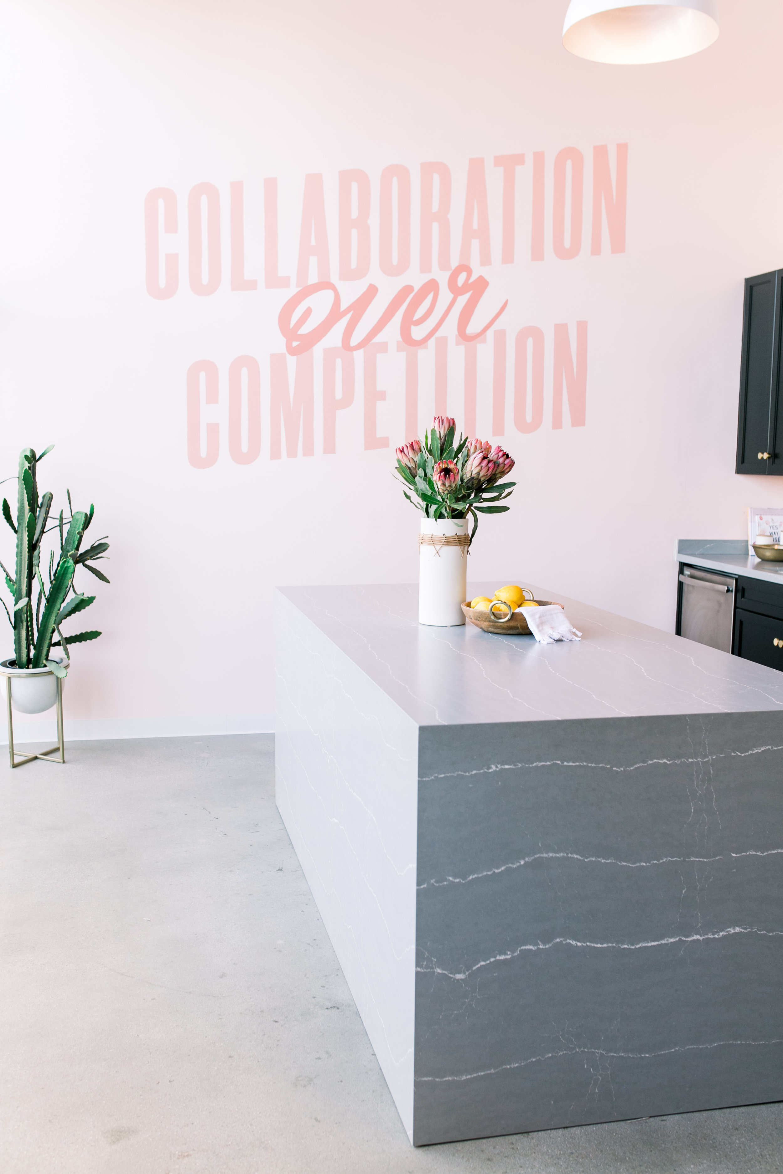
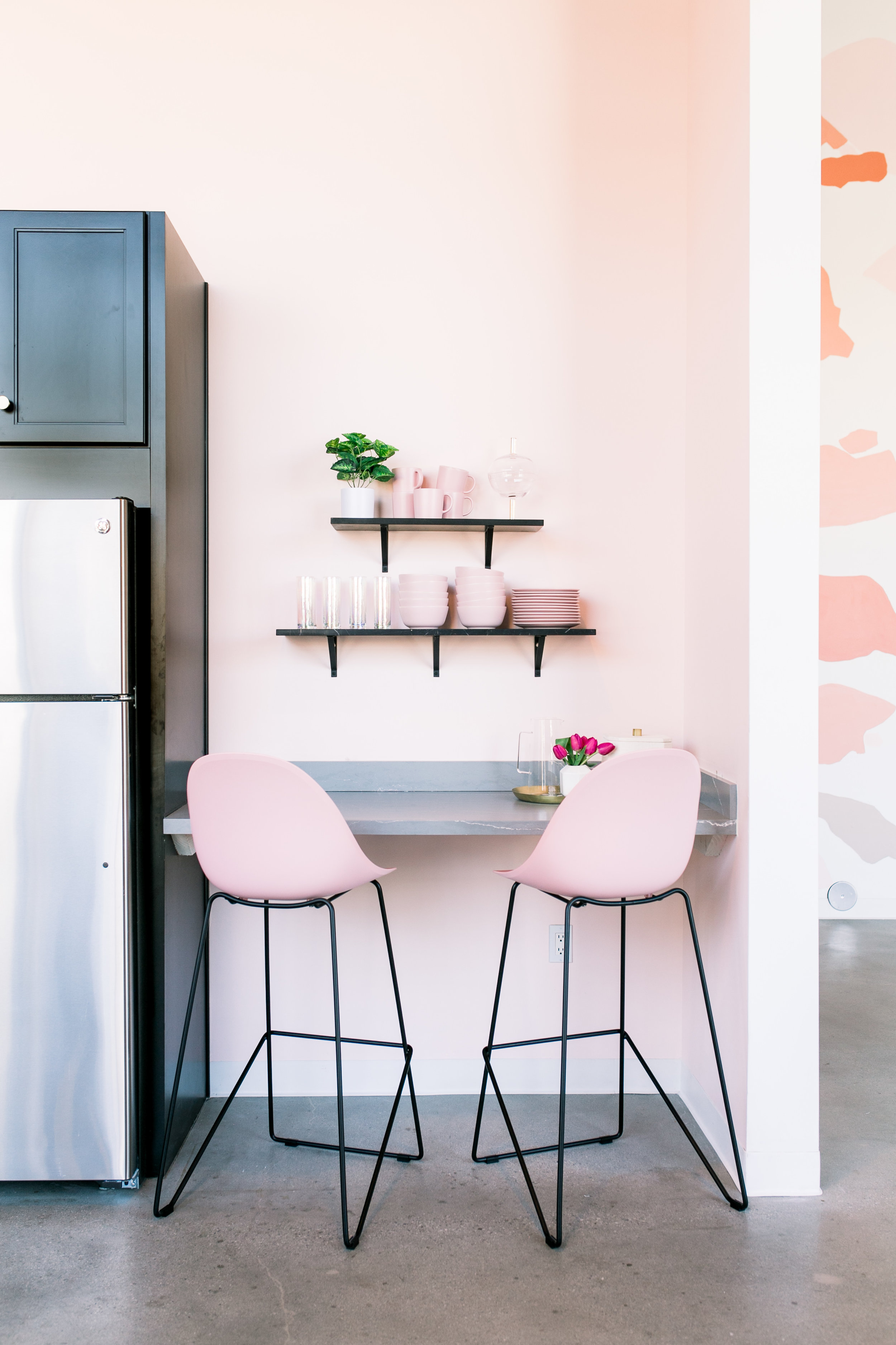
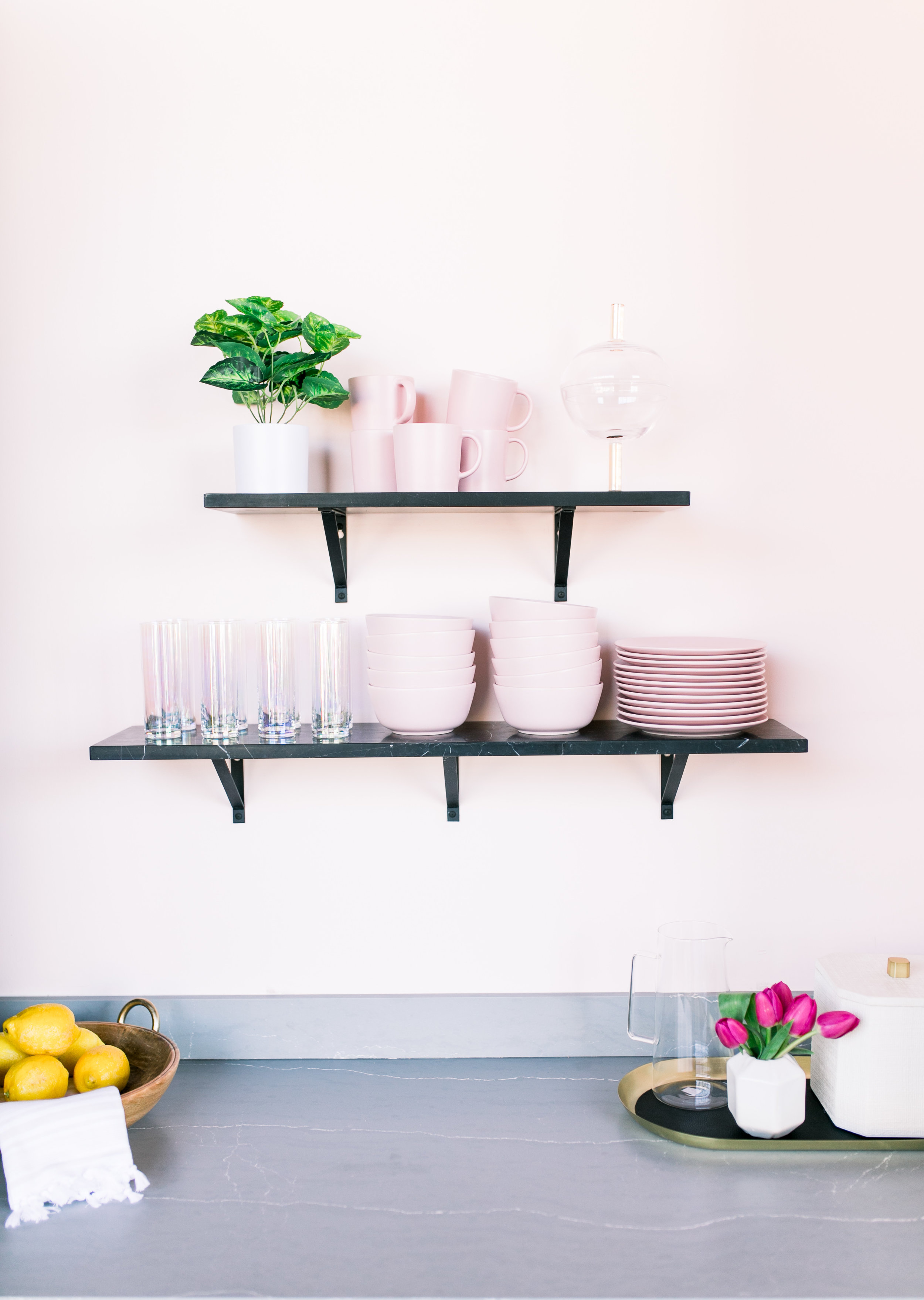
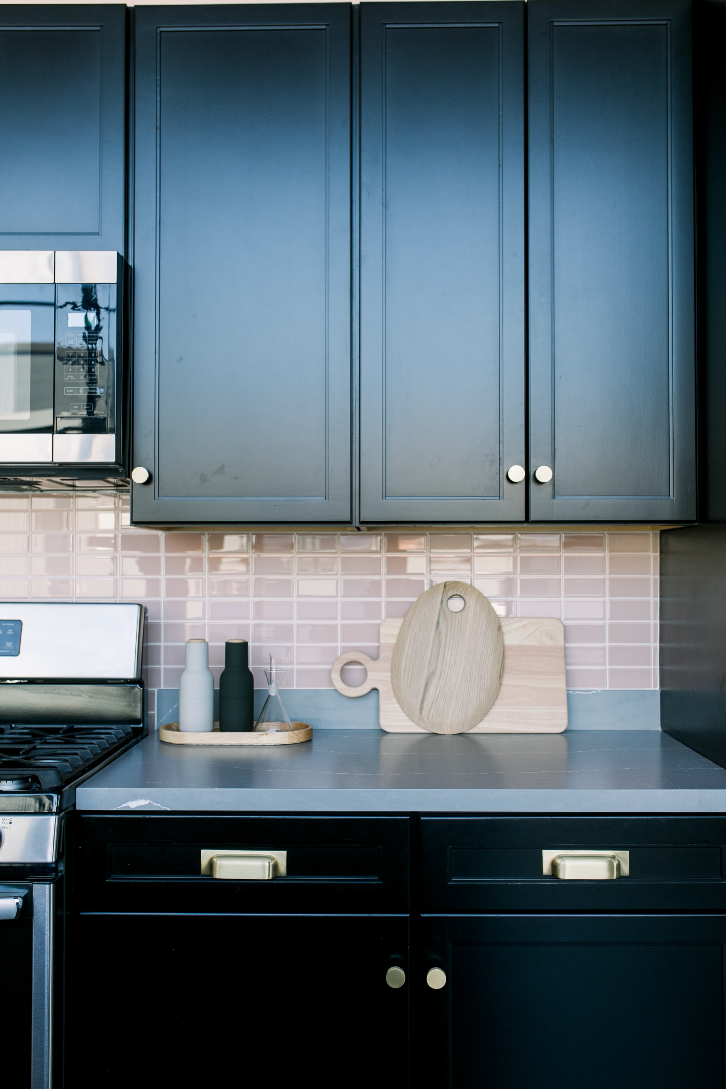
Macdonald considered swapping out the cabinets in the kitchen but it seemed “super wasteful” so she decided to work around them. “Black is such a good base color that goes with everything, especially pink,” she says. The designer stuck to three main colors—black pink, and gray—and added an 8’ long 4-sided waterfall island in a matte finish gray quartz with white veining.
“It looks absolutely incredible and adds a touch of drama in there,” she adds. “We also used the same material to swap out the countertops and added a pretty pink stacked glass tile from Fireclay for the backsplash. I’m so happy glass tiles are coming back because I love how light-reflecting they are.”
Shop the Room:
Dunn Edwards Translucent Silk Paint
Cambria Clareanne Quartz Island
Cedar & Moss Jane Brass Hardware
Cedar & Moss Bjorn Brass Drawer Pull
Joss & Main Darvone 1-Light LED Single Dome Pendant
e-Faucets Newport Brass Single Handle Pull-Down Spray Kitchen Faucet
e-Faucets Newport Brass East Linear Hot & Cold Water Dispenser
e-Faucets Kohler Riverby 33" Drop-In Kitchen Sink
Fireclay Tile Rosy Finch Gloss Tiles
IKEA Dinera 18-Piece Pink Dinnerware Set
The Reception
Photo: Smith House Photo
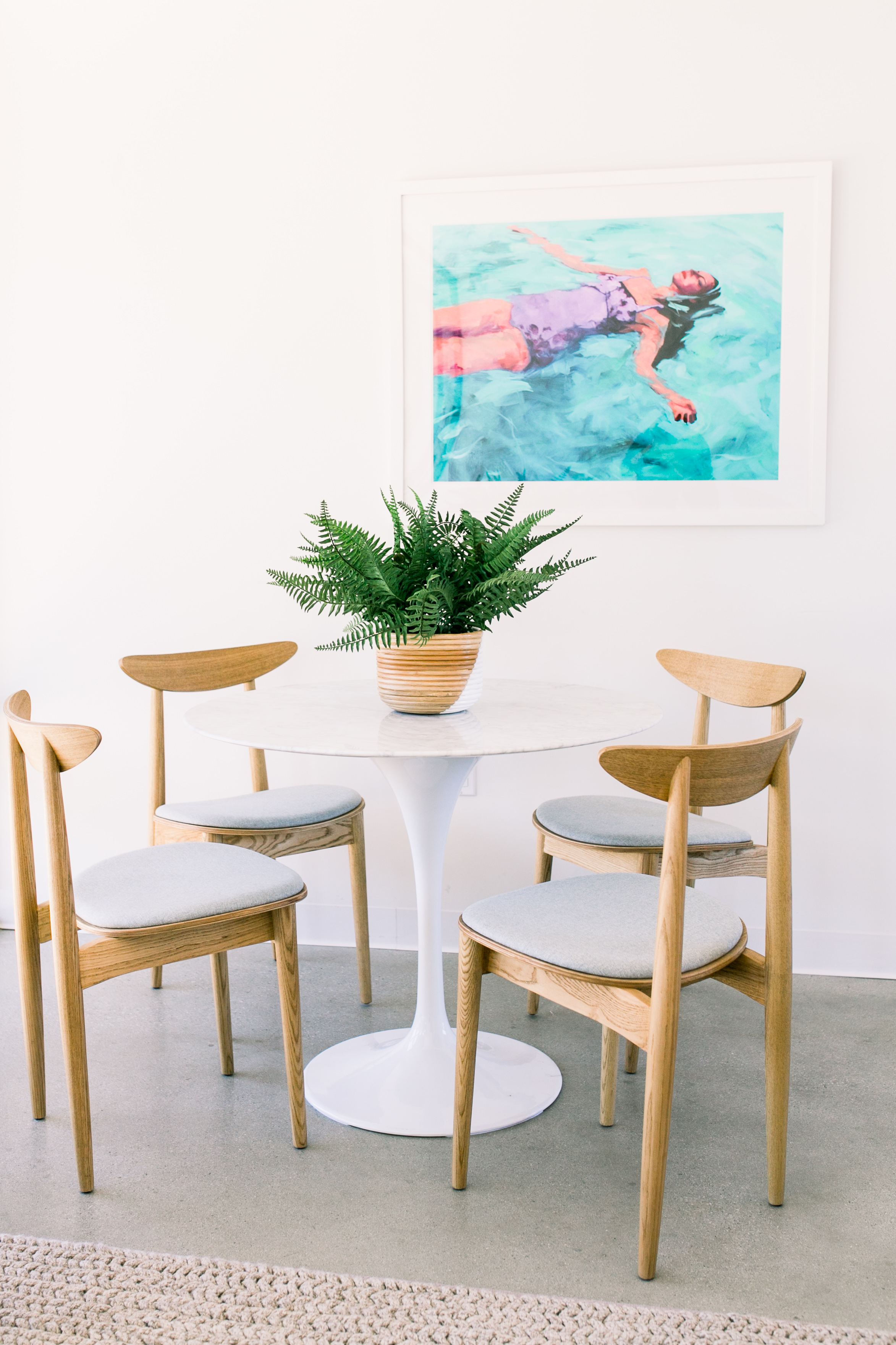
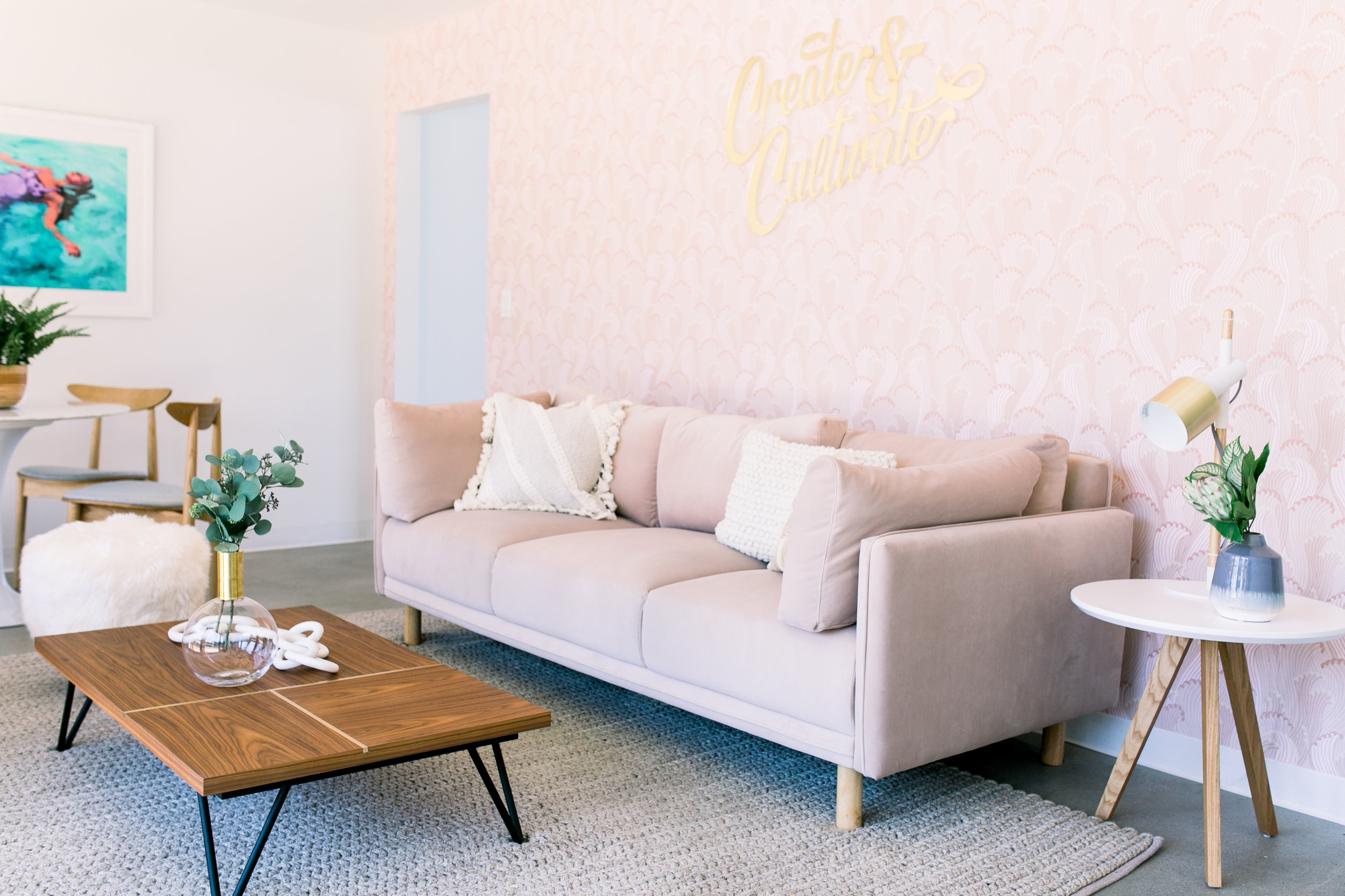
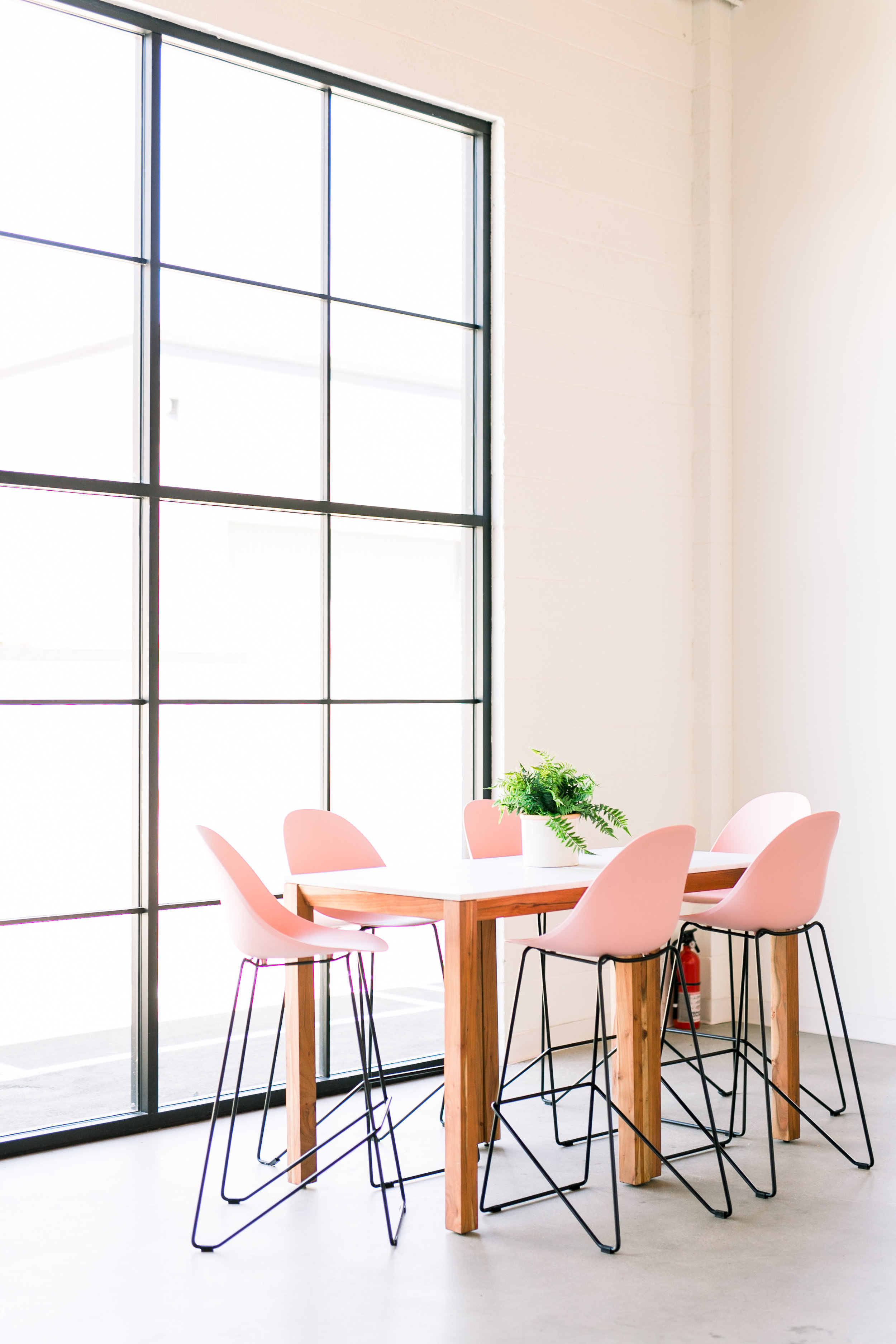
Macdonald was focused on creating pockets of space that went beyond just sitting at a desk all day. “We added two lounge areas and a few seating nooks where the girls can grab their laptops and hang out on a comfy sofa or take a call away from their desks to have a little privacy,” she says. “I love this pink reception area mainly because of the wall of patterned wallpaper. It’s a long and narrow space but we still managed to make two areas for people to work in—sofa or corner dining table. I would be super happy to sit in either of these rooms to take a break from my desk.”
Photo: Smith House Photo
“The general vibe is badass CEO.”
Macdonald partnered with CB2 to design Johnson’s office. “The general vibe is badass CEO and while we have our bright pops of color elsewhere, we kept this room feeling über sophisticated,” remarks Macdonald. To do this, Macdonald used a marble-topped dining table instead of a traditional desk to create a large work surface.
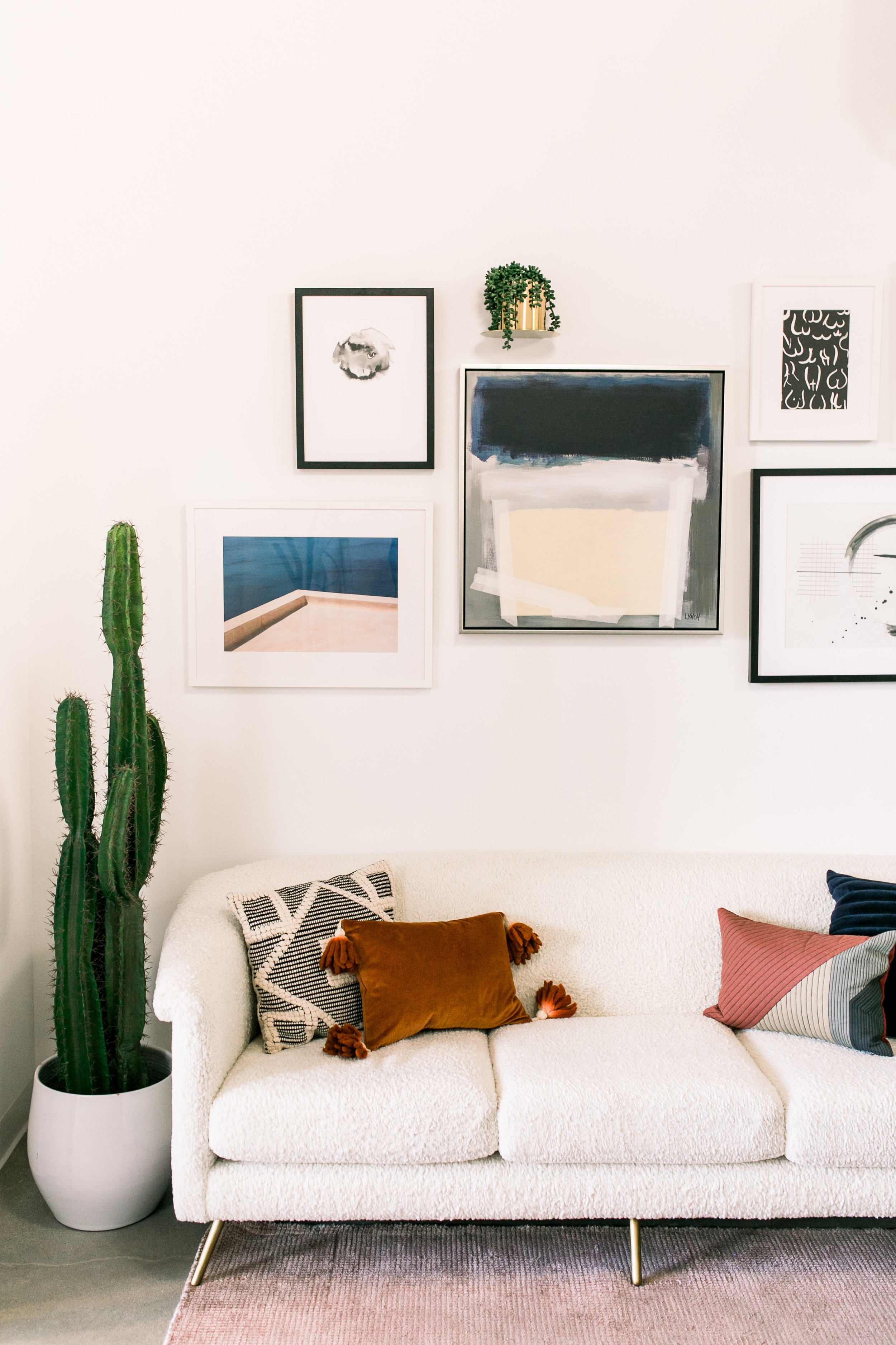
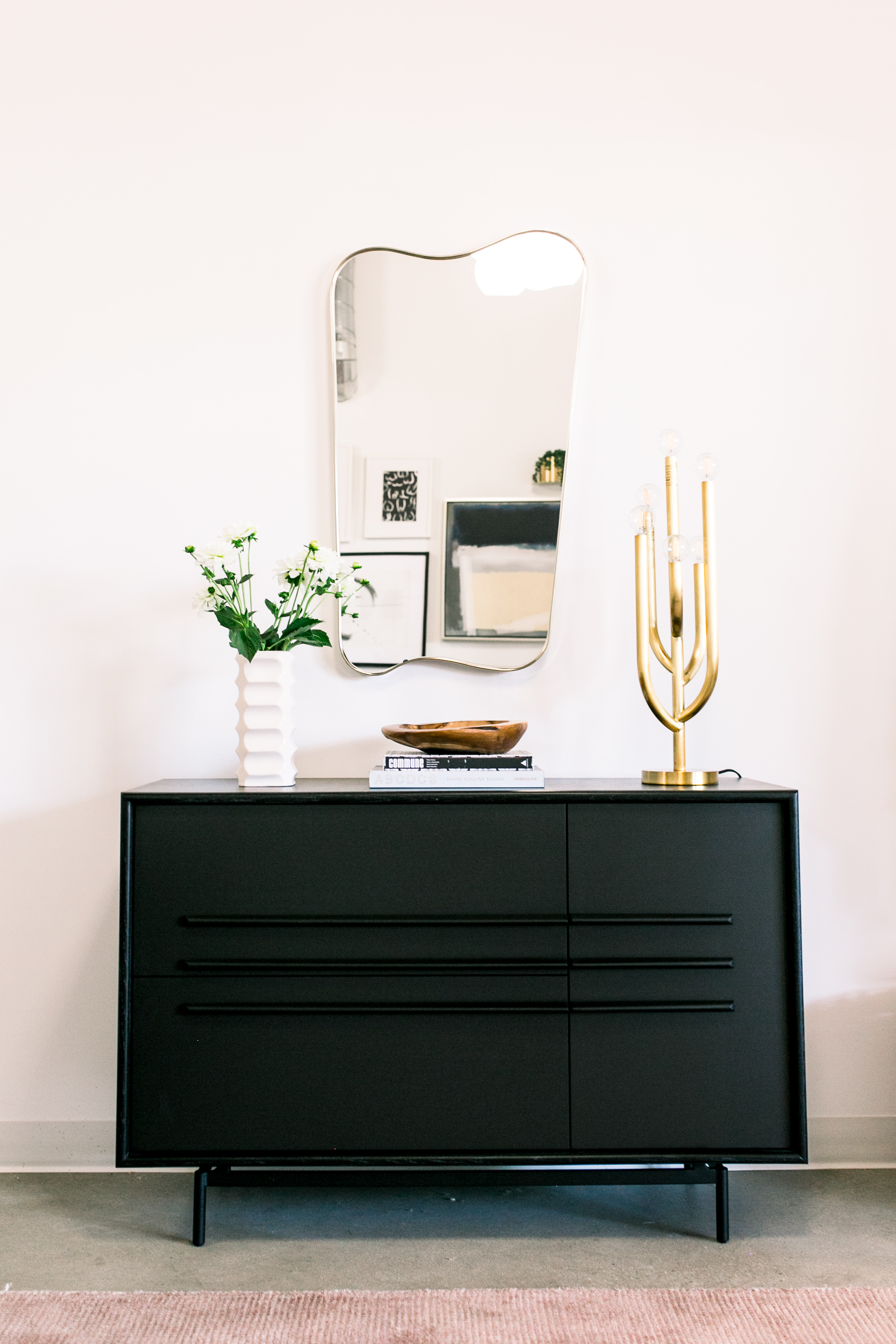
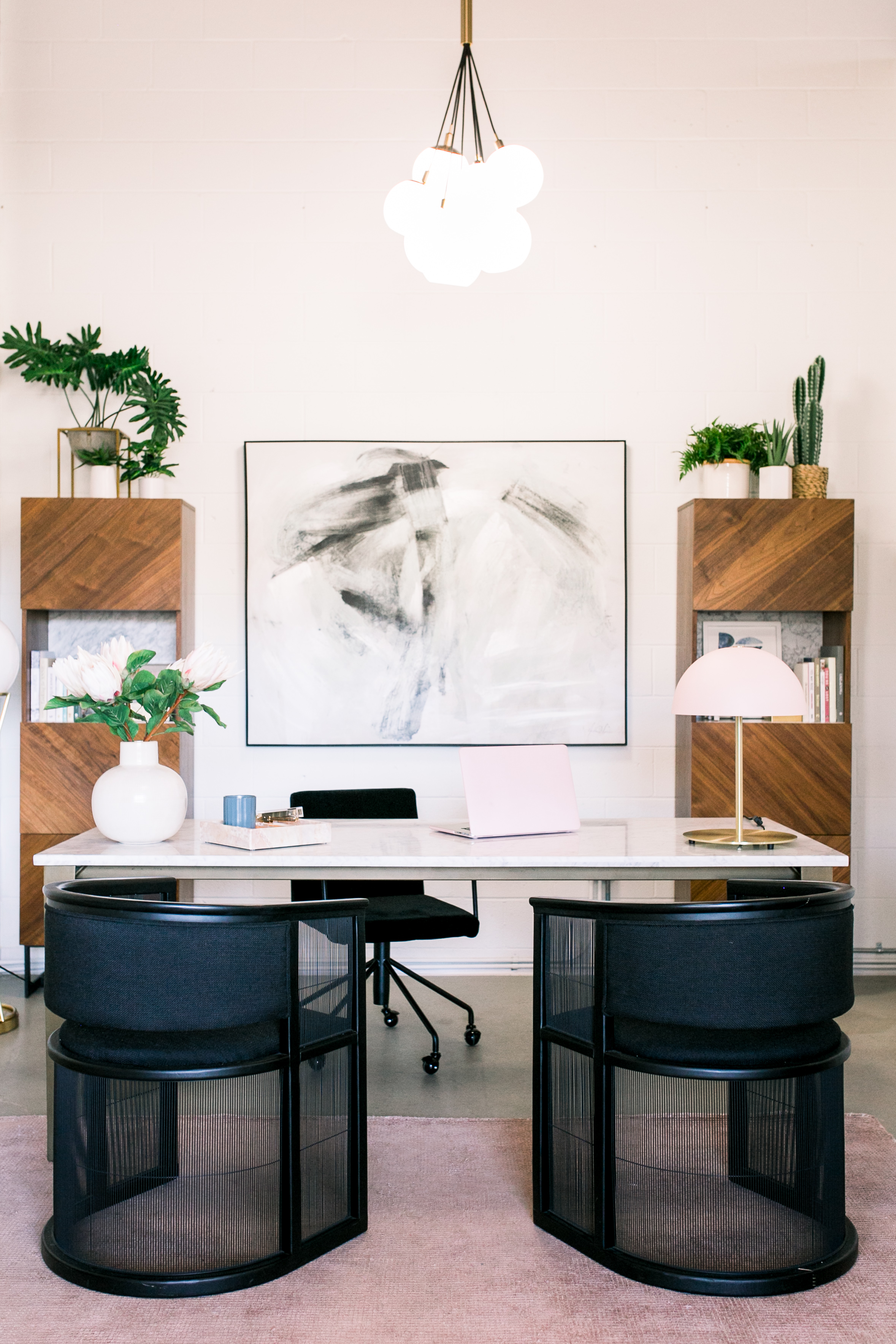
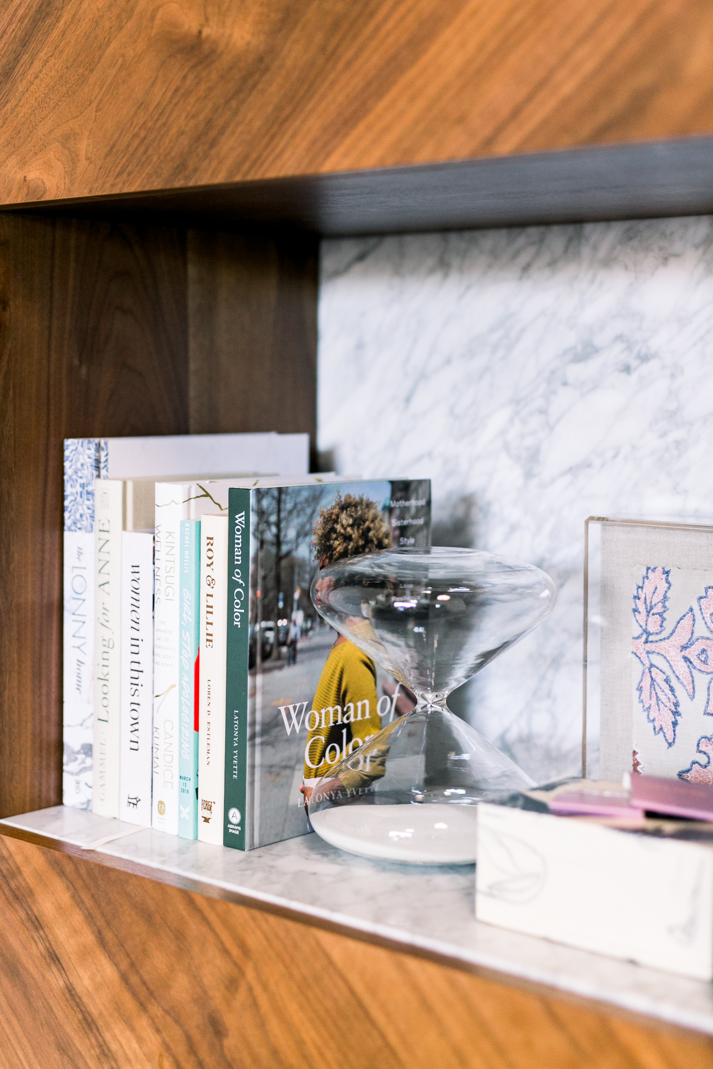
Macdonald then installed an oversized art piece on the back wall and flanked it with two tall wood storage pieces to add warmth and height. The plants on top of each unit also help to break up the symmetry and add some softness to the room.
Photo: Smith House Photo
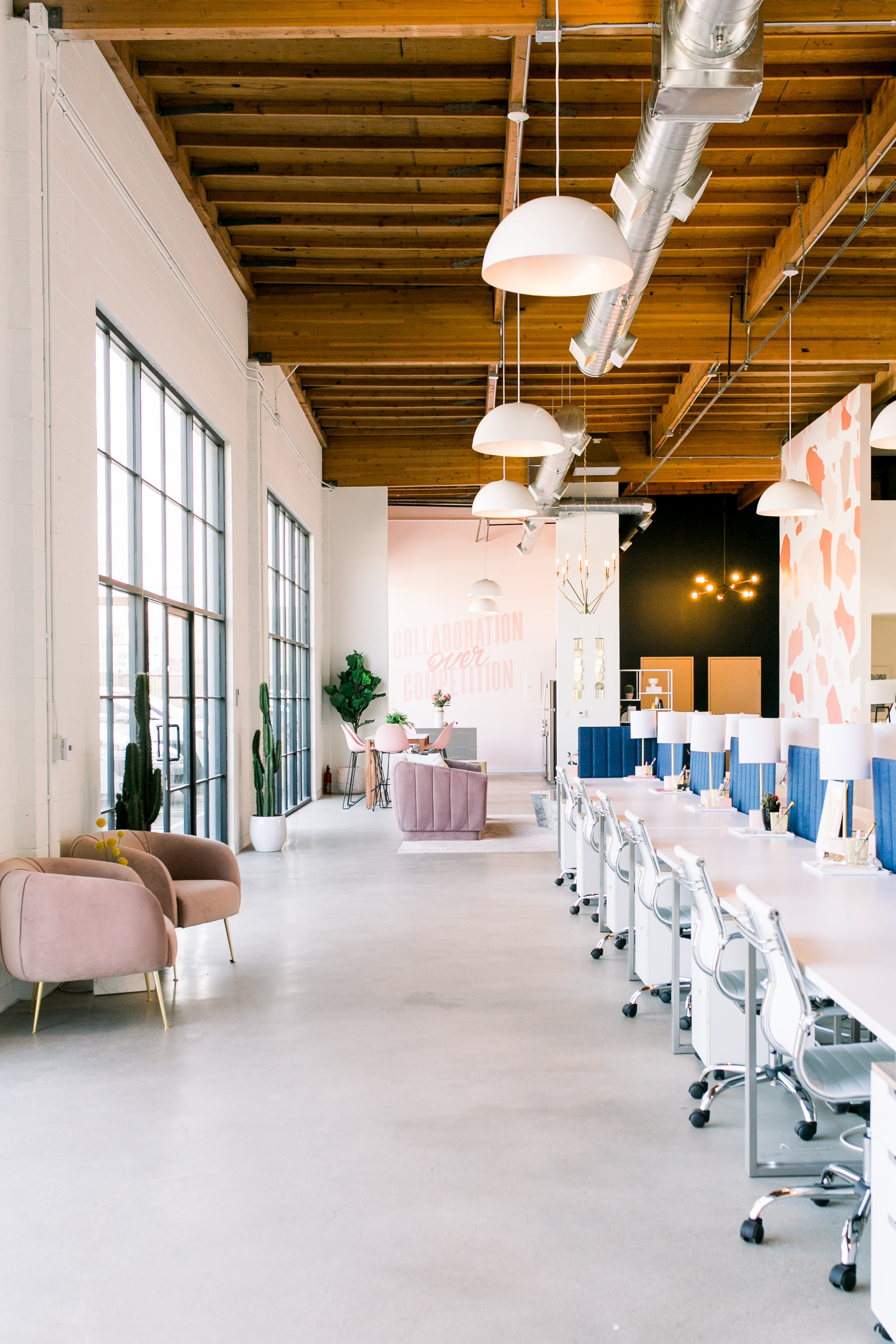
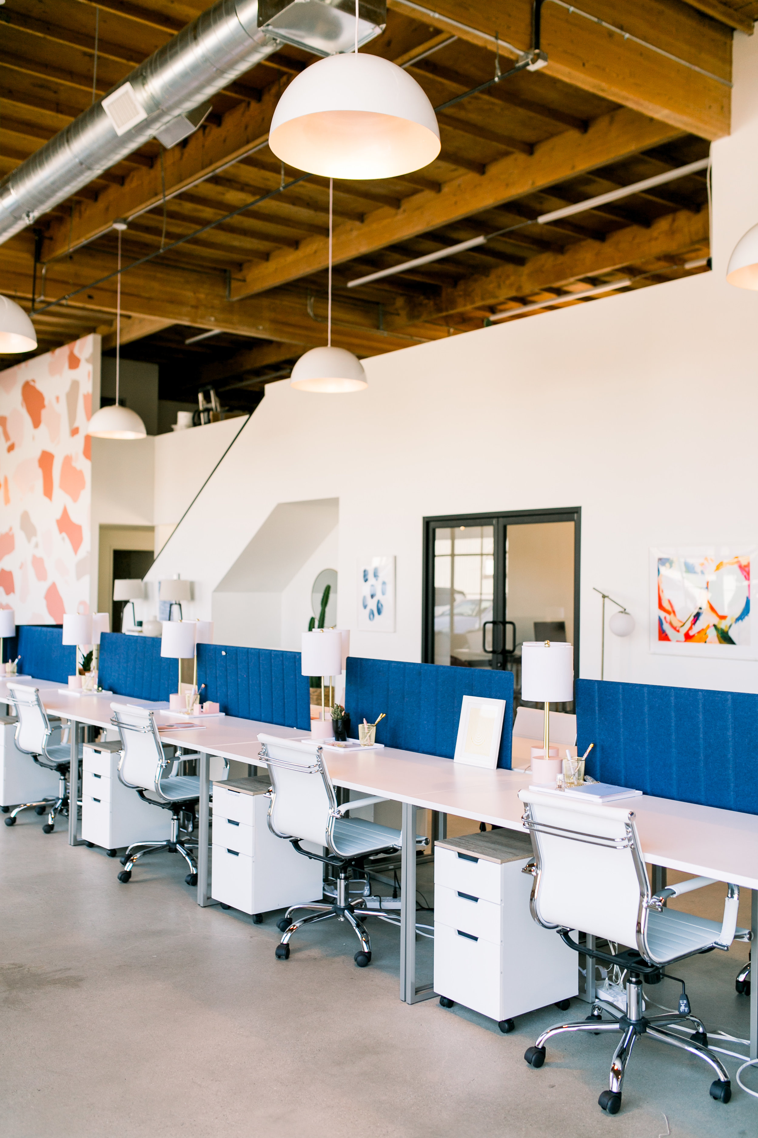
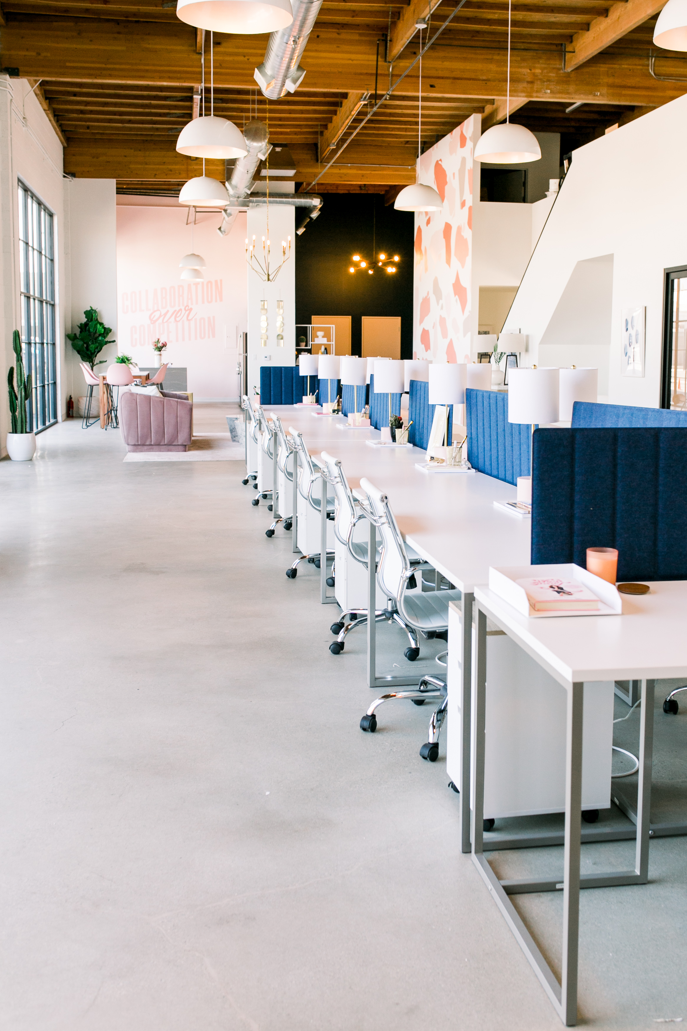
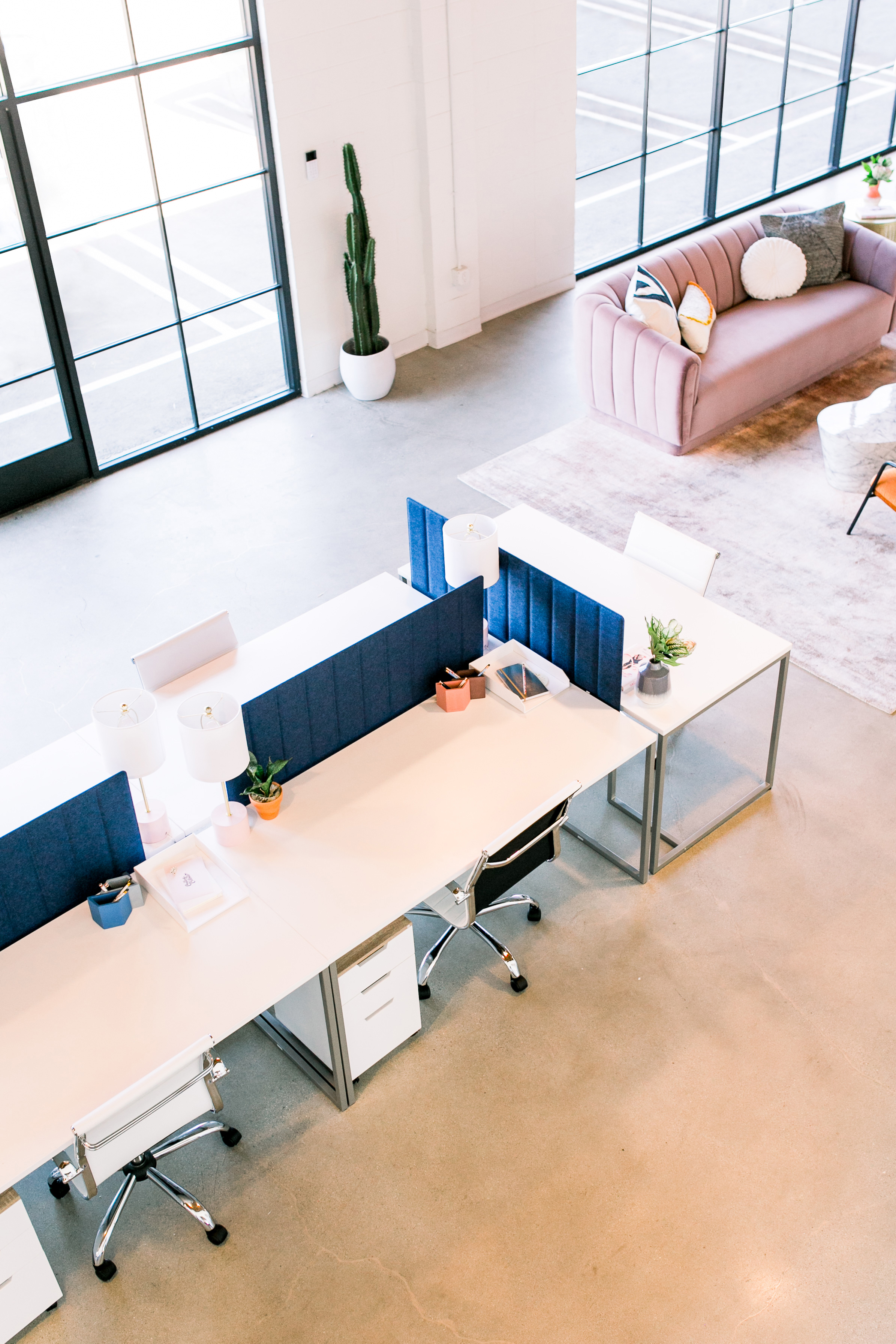
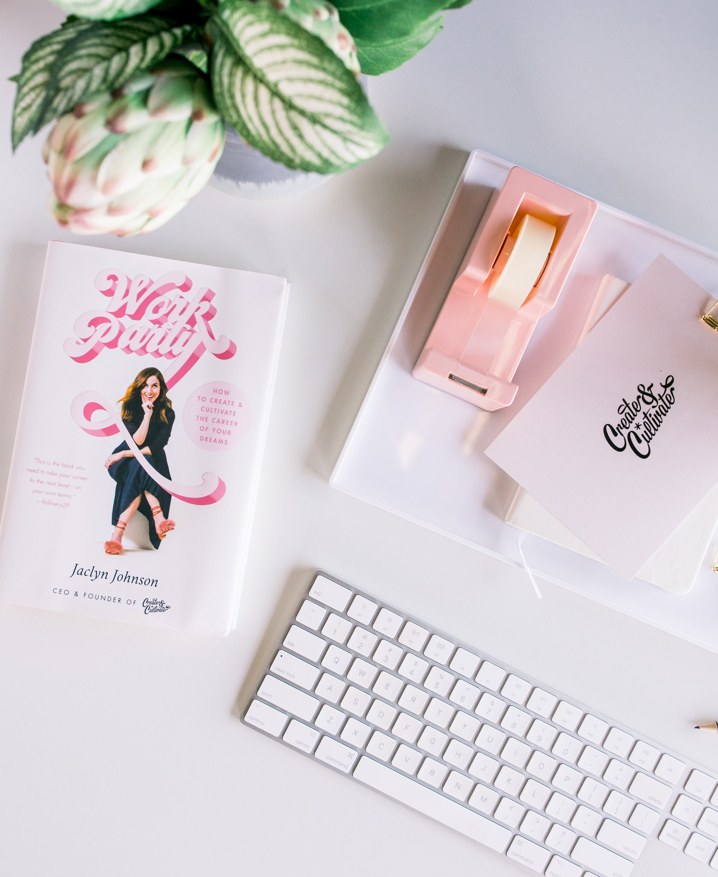
Both Johnson and Macdonald wanted to capture the playful essence of the Create & Cultivate brand in the bullpen which is colorful, fun, and high energy but also elevated and chic. “The company is incredibly inspiring to women worldwide so we really wanted the space to represent that,” she explains.
The bullpen space is a long and narrow galley, so they really played into that when setting out the furniture. “We laid out the desks back-to-back in a long linear line which followed the elongation of the space,” she says. “Not only does this create a feeling of openness it allows for a collaborative and inspiring shared workspace.”
The goal was to keep this section really clean and simple since it takes up most of the space in the building. Everything is essentially white—all the desks, chairs, file cabinets and lighting—so the pops of color came from the pink lamp base and the blue pin board screens which they added to tie in with the “blue cave” at the back corner of the office.
Shop the Room:
Joss & Main Method Writing Desk
Joss & Main Villalba Table Lamp
The Container Store Blush Poppin Tape Dispenser & Stapler
RH Teen Classic Metal Frame Pinboard
The Lounge
“We tried to make this room feel like something you’d have in your own home.”
If she had to play favorites, Macdonald would put the lounge area at the top of her list. “Work and home life tends to really collide these days so having break-out spaces that don’t feel corporate and stuffy are really important,” she says. “That’s why we tried to make these feel like something you’d have in your own home.”
Since the lounge area floats in the middle of the space, they decided on a pink channel tufted velvet sofa which looks pretty when seen from all sides. They paired it with two rust toned crushed velvet side chairs with black frames to help edge it up a little. The coffee table—a heavy sculptured marble in an irregular organic shape—makes a cool statement piece and despite how physically heavy it is, Macdonald says it feels light in the space because of the color and shape.
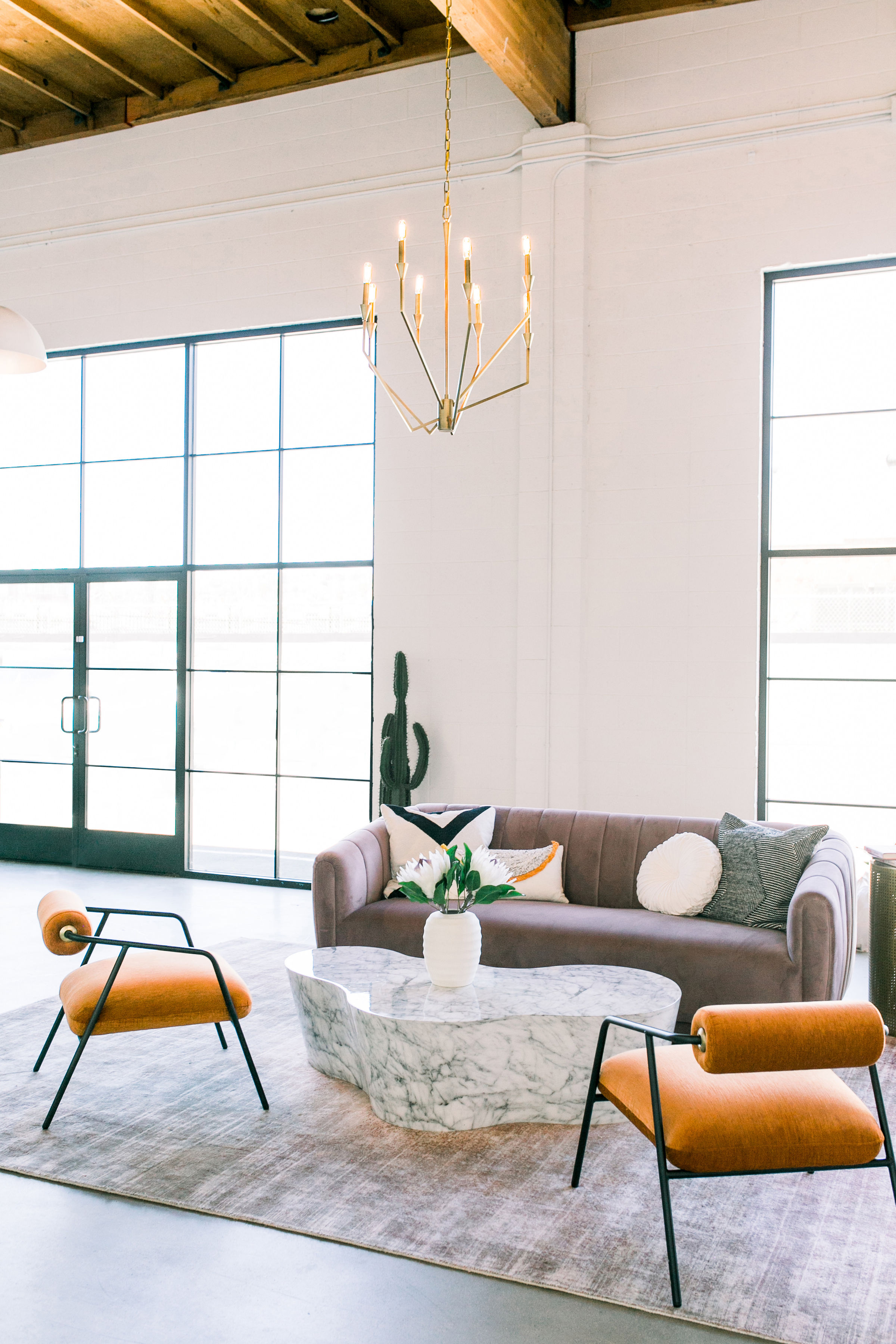
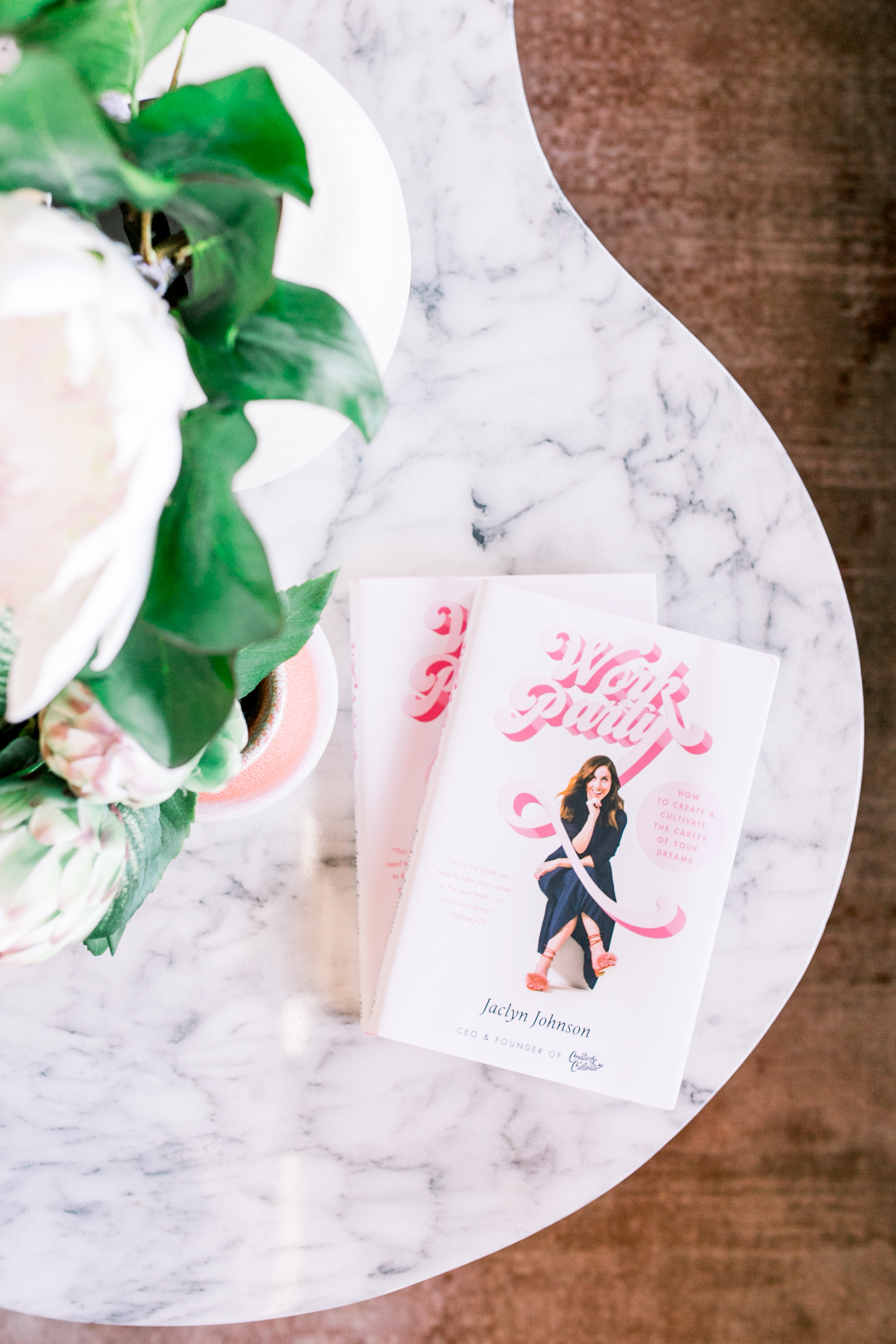
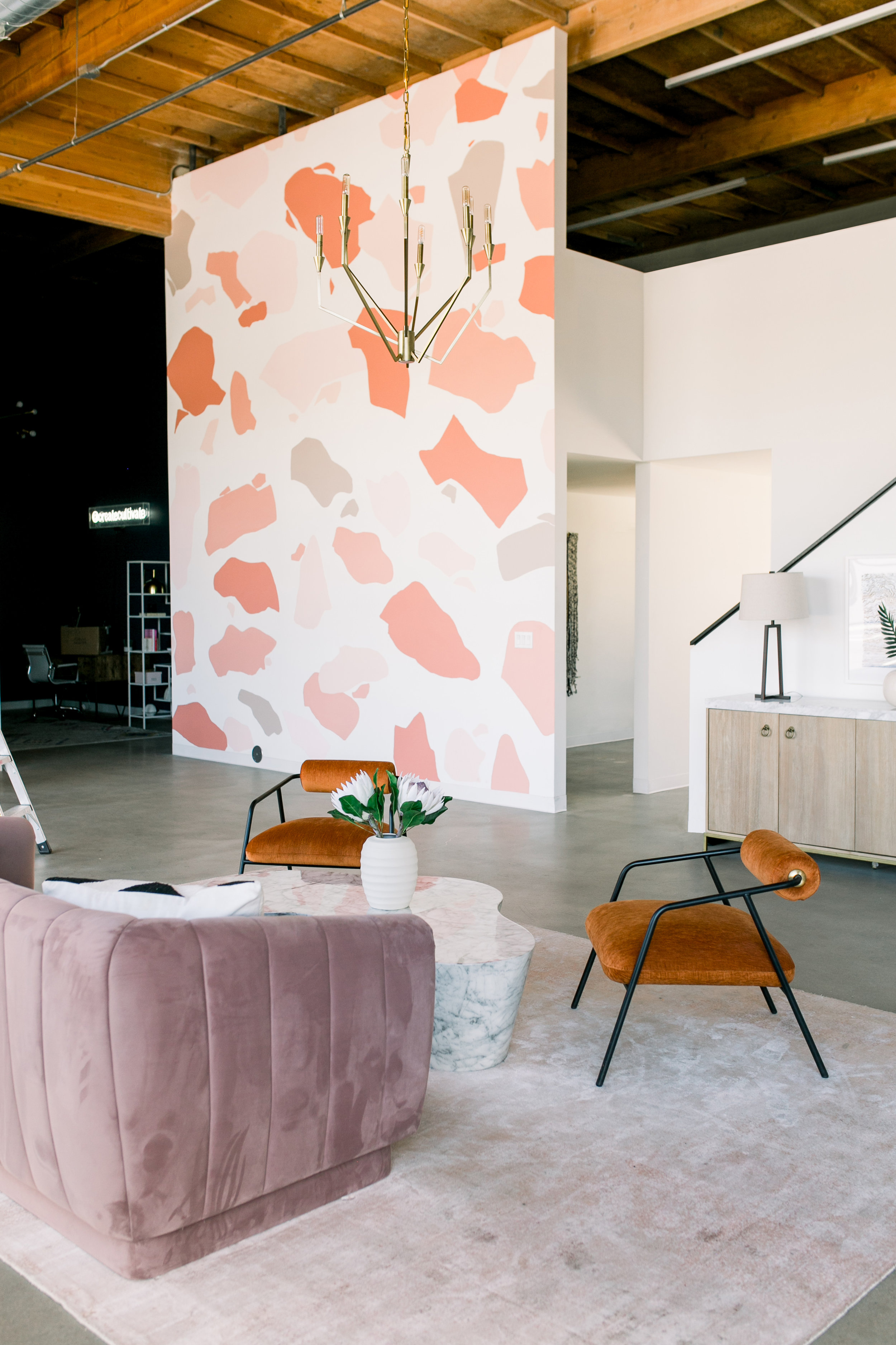
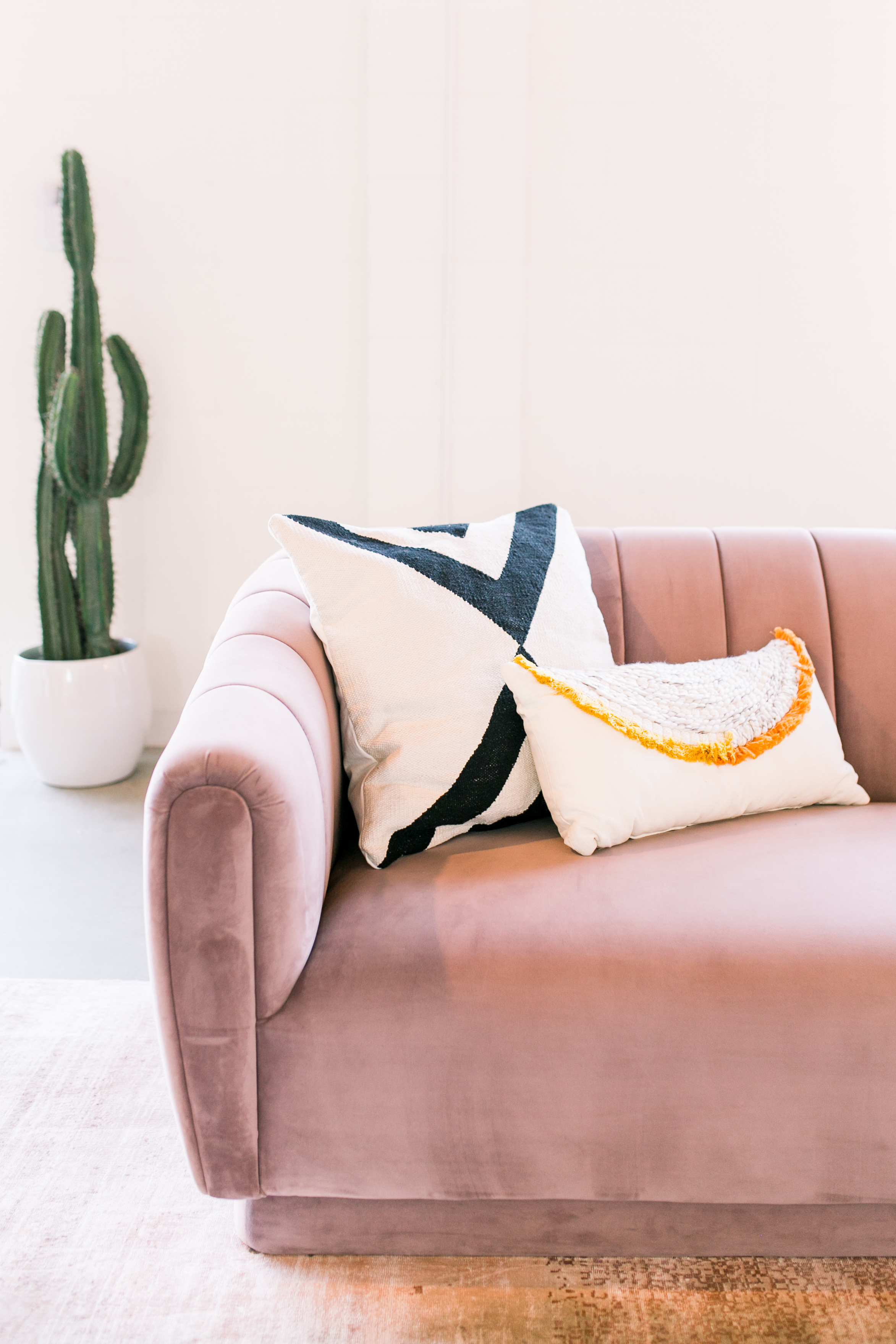
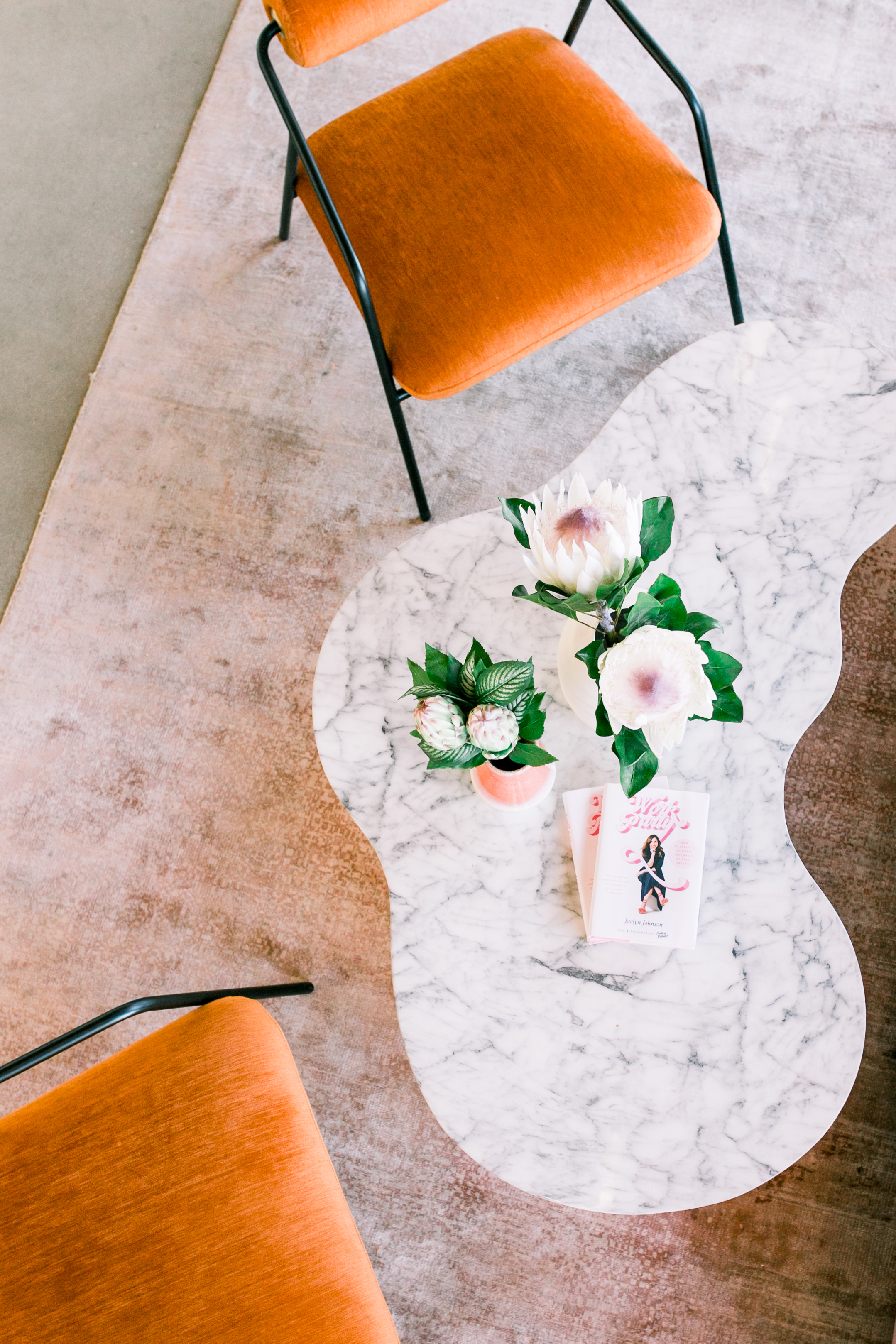
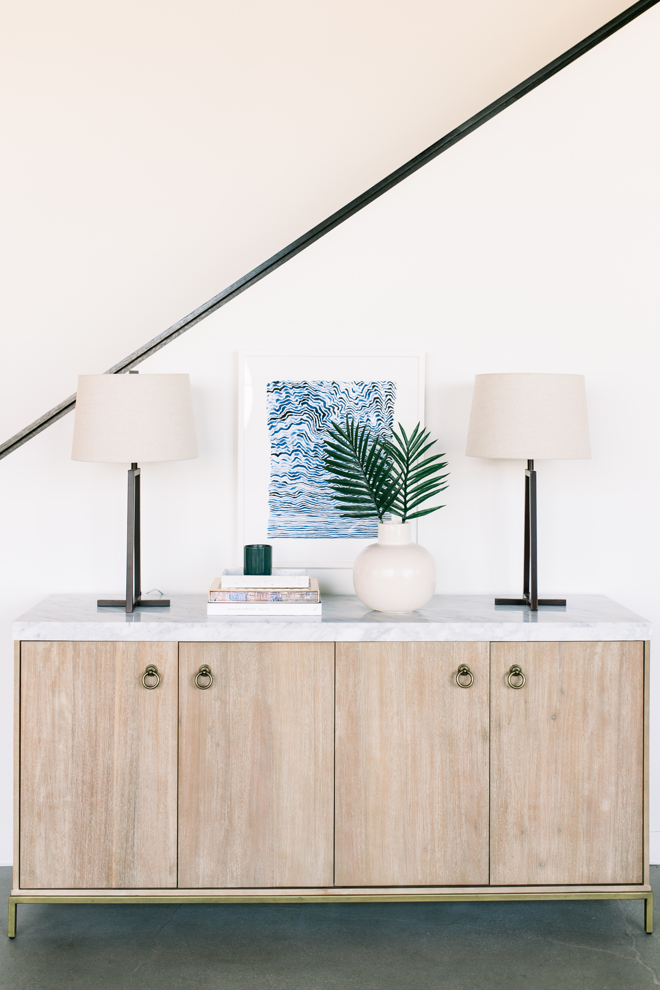
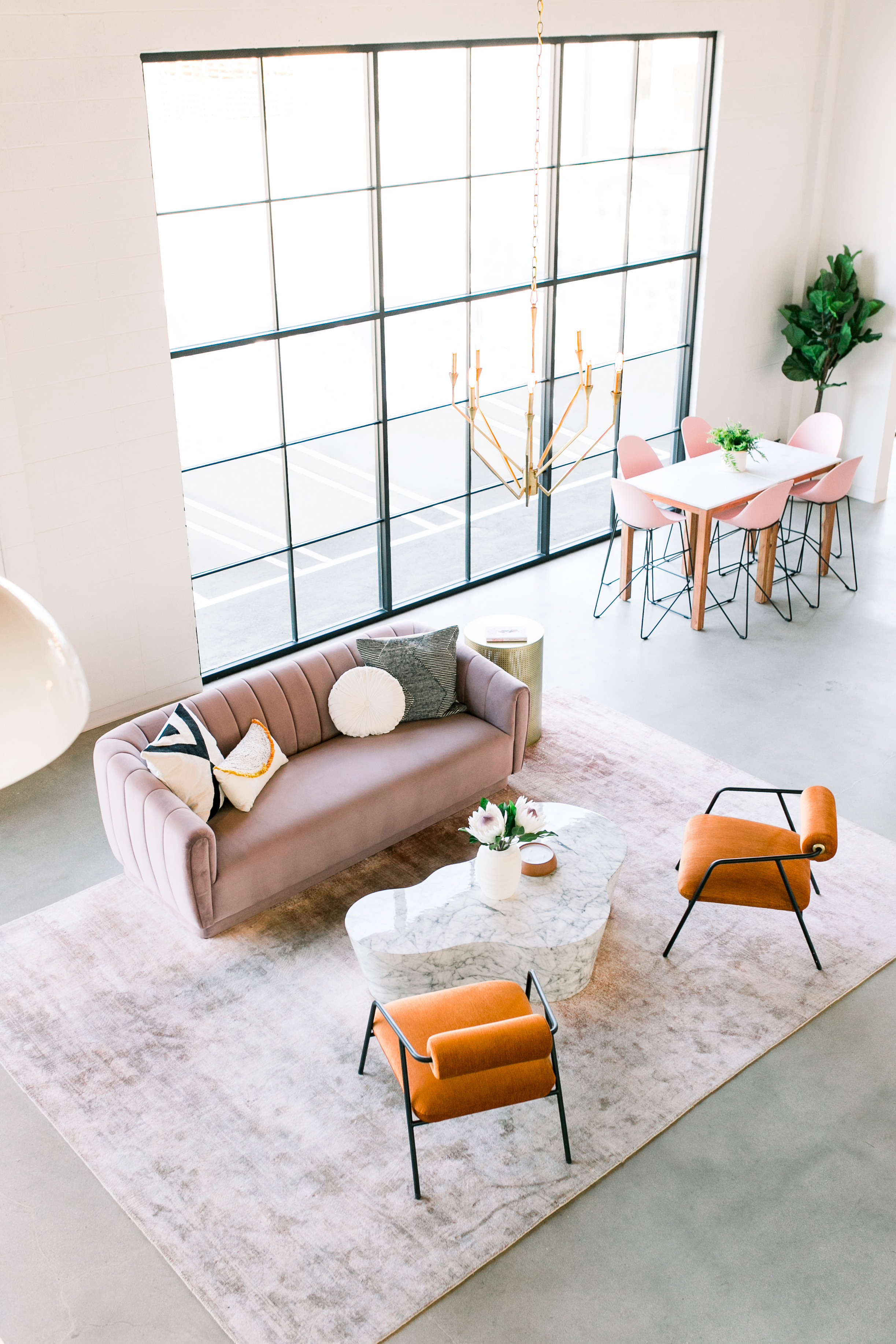
Photo: Smith House Photo
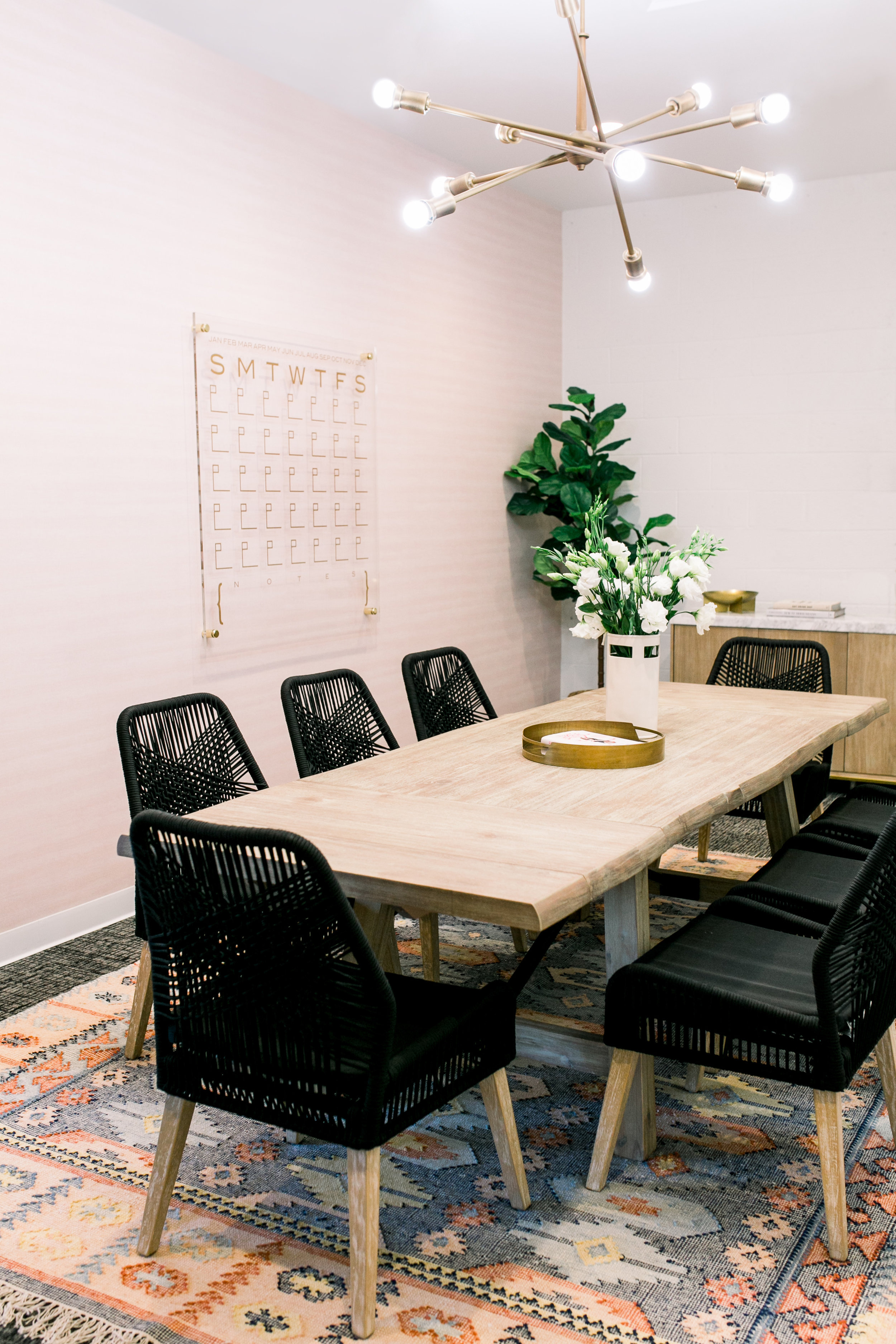
The conference room was a challenge because they had to work with the existing black and gray carpet. “Since we were trying to be budget conscious we couldn’t swap it out and redo the concrete floors underneath, so instead we layered a brightly color rug on top to break it up,” she says. “This is a good tip for when you don’t love the floor finish you’re working with. We chose a rug that was bright but still had darker undertones so that it still worked with the carpet.” The light pink textured wallpaper on the walls also helped to soften the space and draw your eye away from the dark floor covering.
Shop the Room:
Joss & Main Carothers Dining Chair
Joss & Main Almazan Buffet Table
Joss & Main Asher 12-Light Sputnik Chandelier
Wallpaper Warehouse Lepore Blush Linen Wallpaper
CB2 Marcella Brass Antique Mirror Tray
The Blue Cave
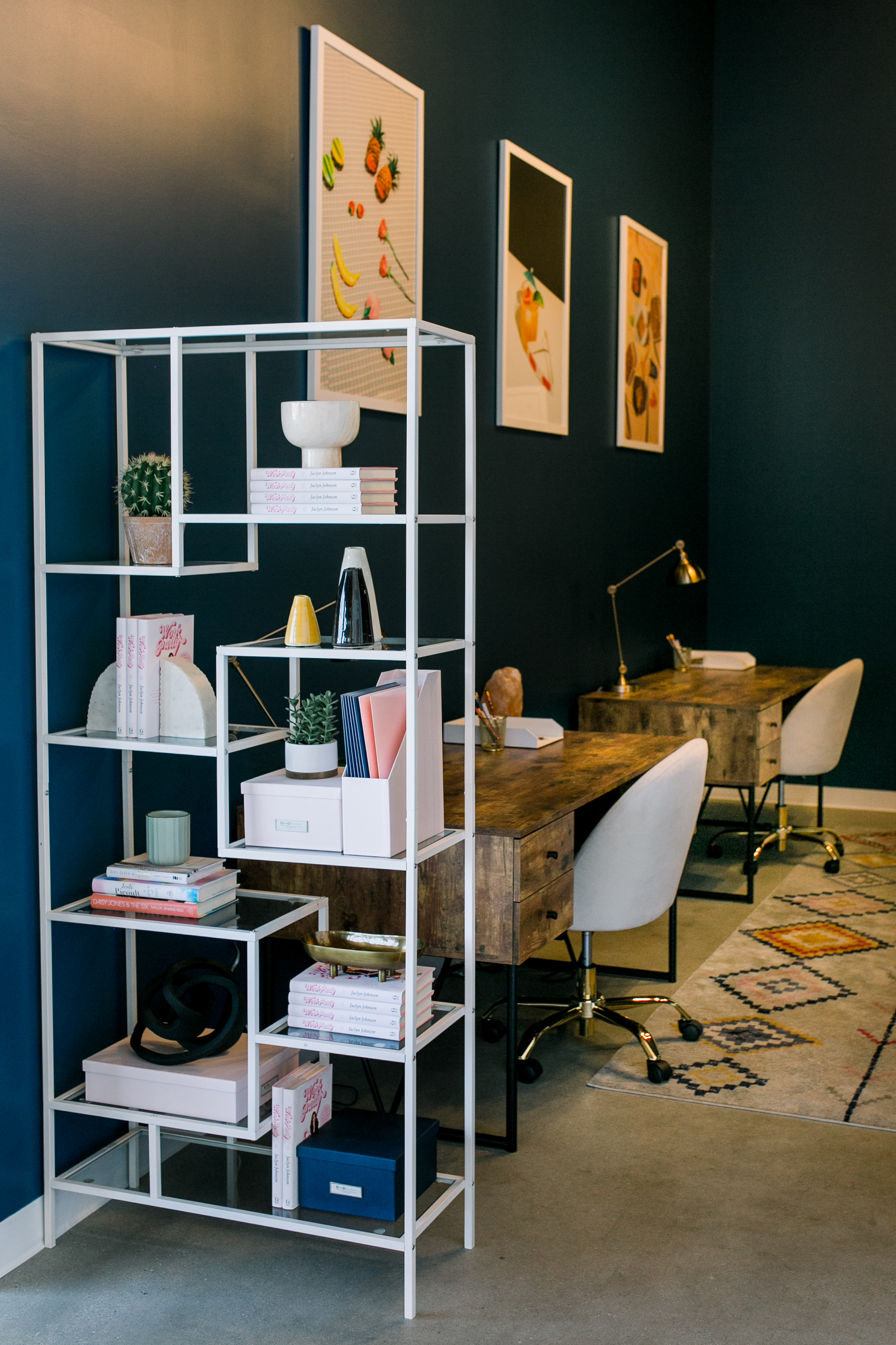
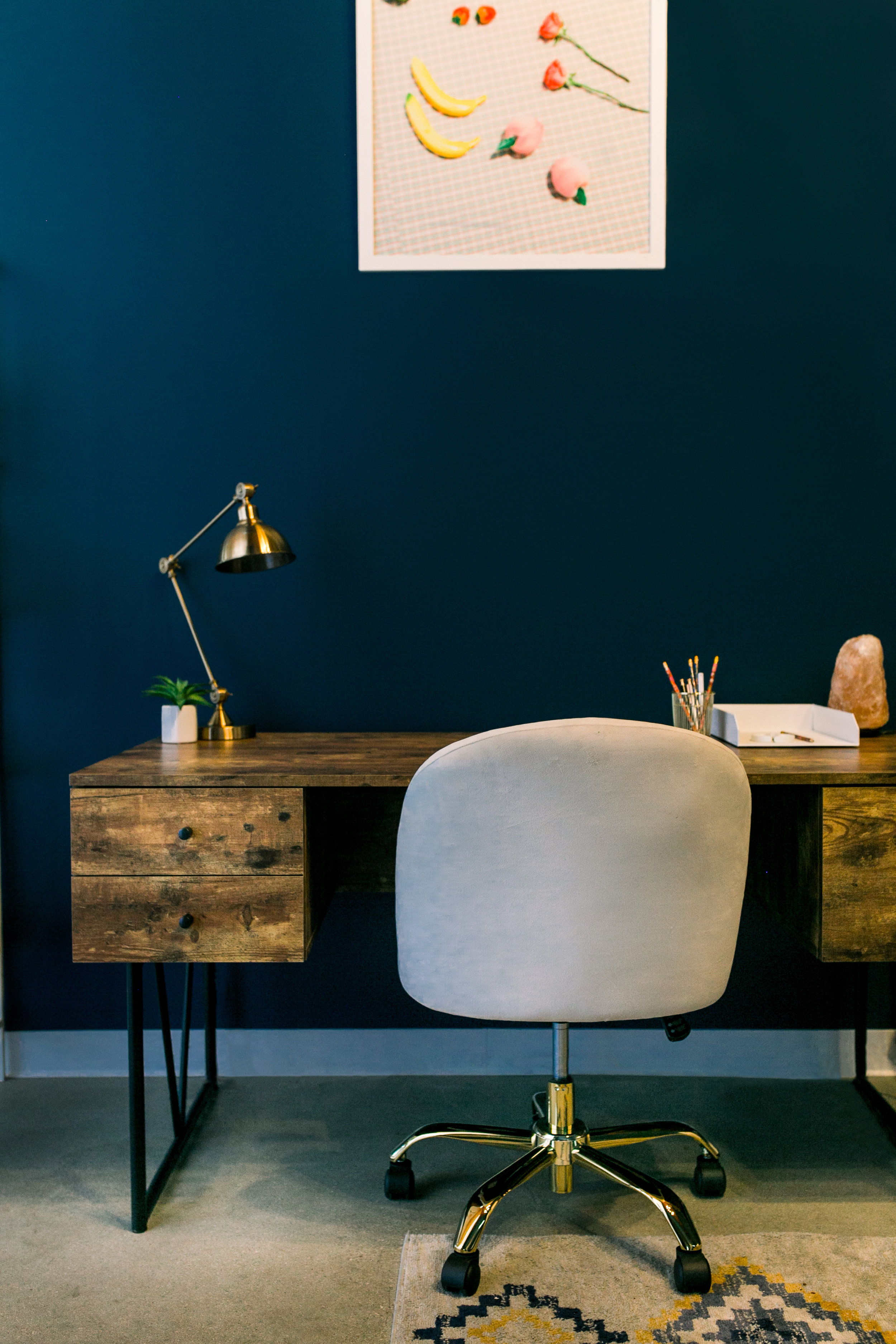
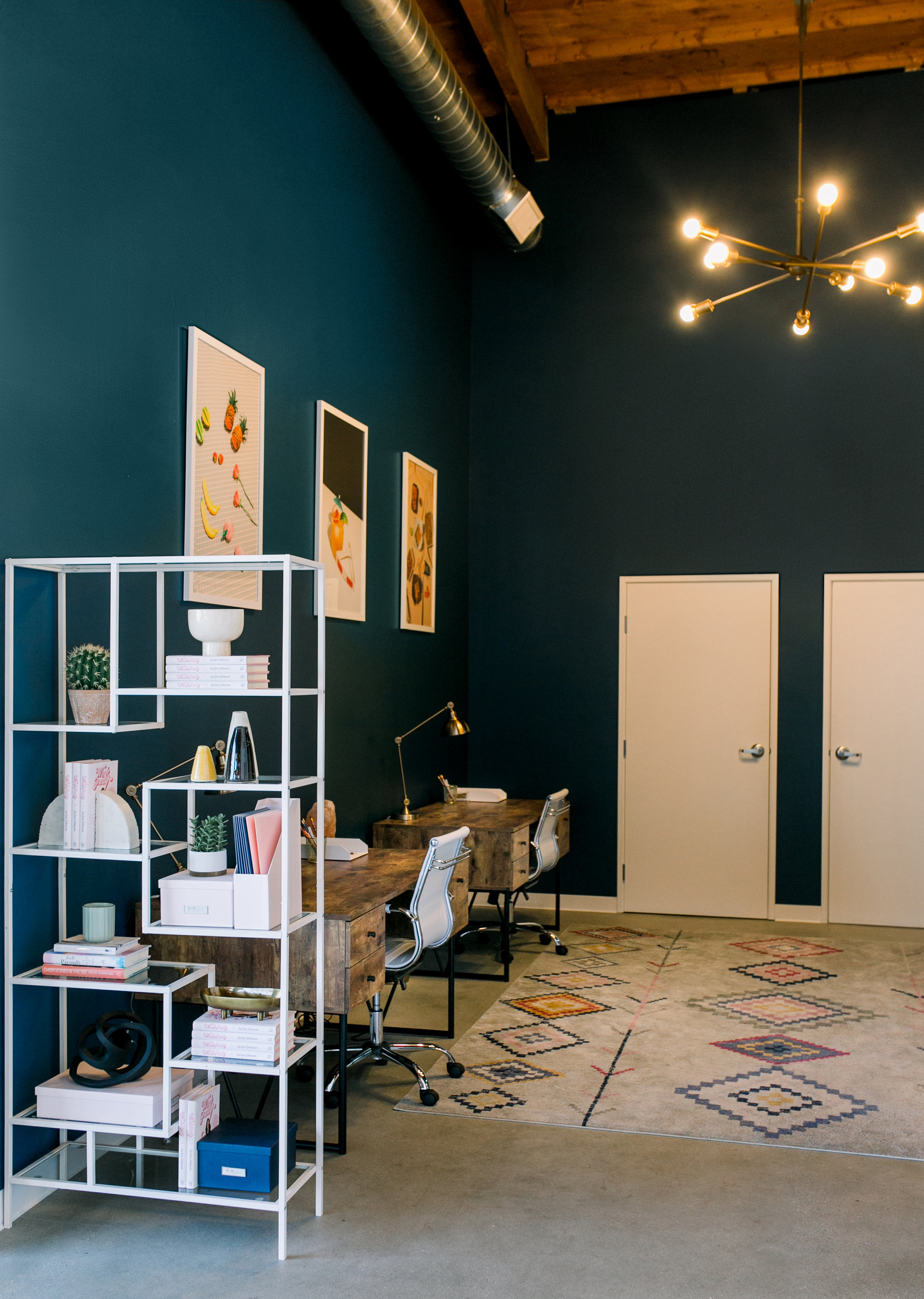
Both Macdonald and Jaclyn are big fans of blue so they painted the walls in the office nook aka “The Blue Cave” in a deep navy hue. “This helps the space to feel grounded and it’s also a break from all the pink,” she laughs. This room feels aligned with Macdonald’s personal design style which draws on her U.K. roots or what she coins “rustic countryside style.” She loves to fuse the simplicity of the Scandinavian aesthetic with Japanese design. “I like a room to feel calm, cosy and fresh, well-put-together without being stuffy,” she says.
Shop the Room:
Joss & Main Fallon 4 Drawer Writing Desk
Dunn Edwards Summer Night Paint
Joss & Main Mid-Back Task Chair
Joss & Main Alden Etagere Bookcase
Joss & Main Asher 12-Light Sputnik Chandelier
Joss & Main Deegan 31" Table Lamp
Joss & Main Diamond Motif Zen Light Gray Area Rug
Framebridge Be Cool Man (Repeller) Print
The Bathrooms
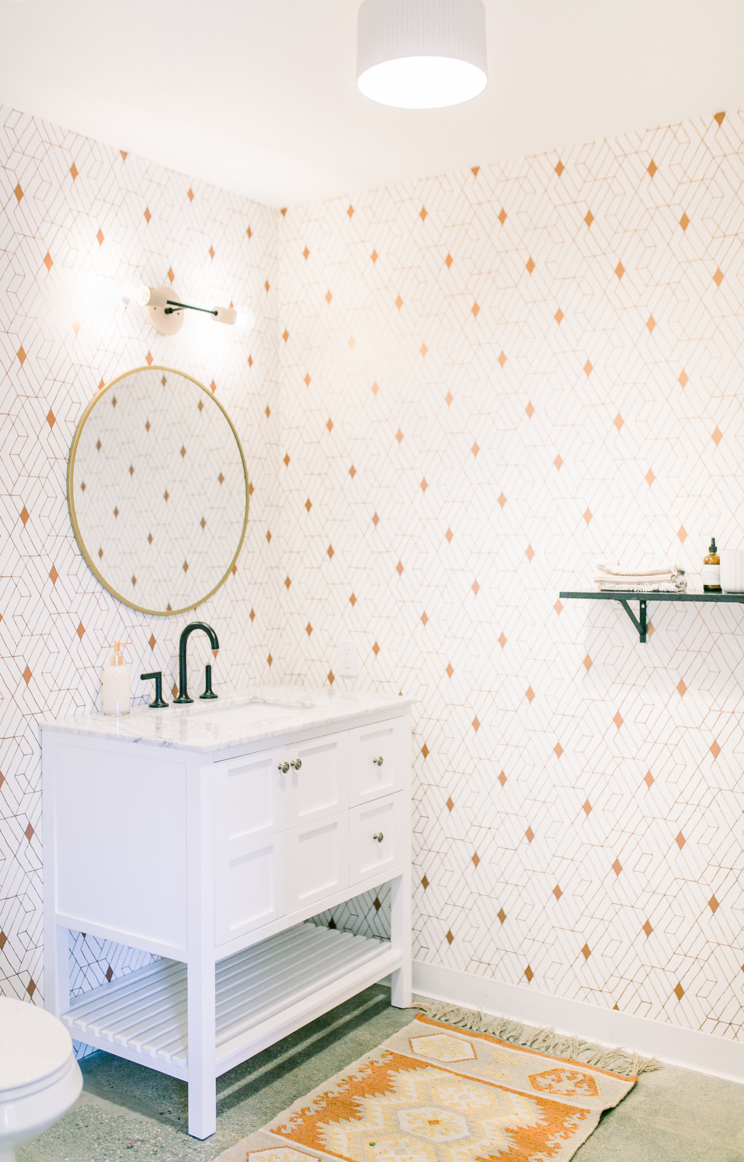
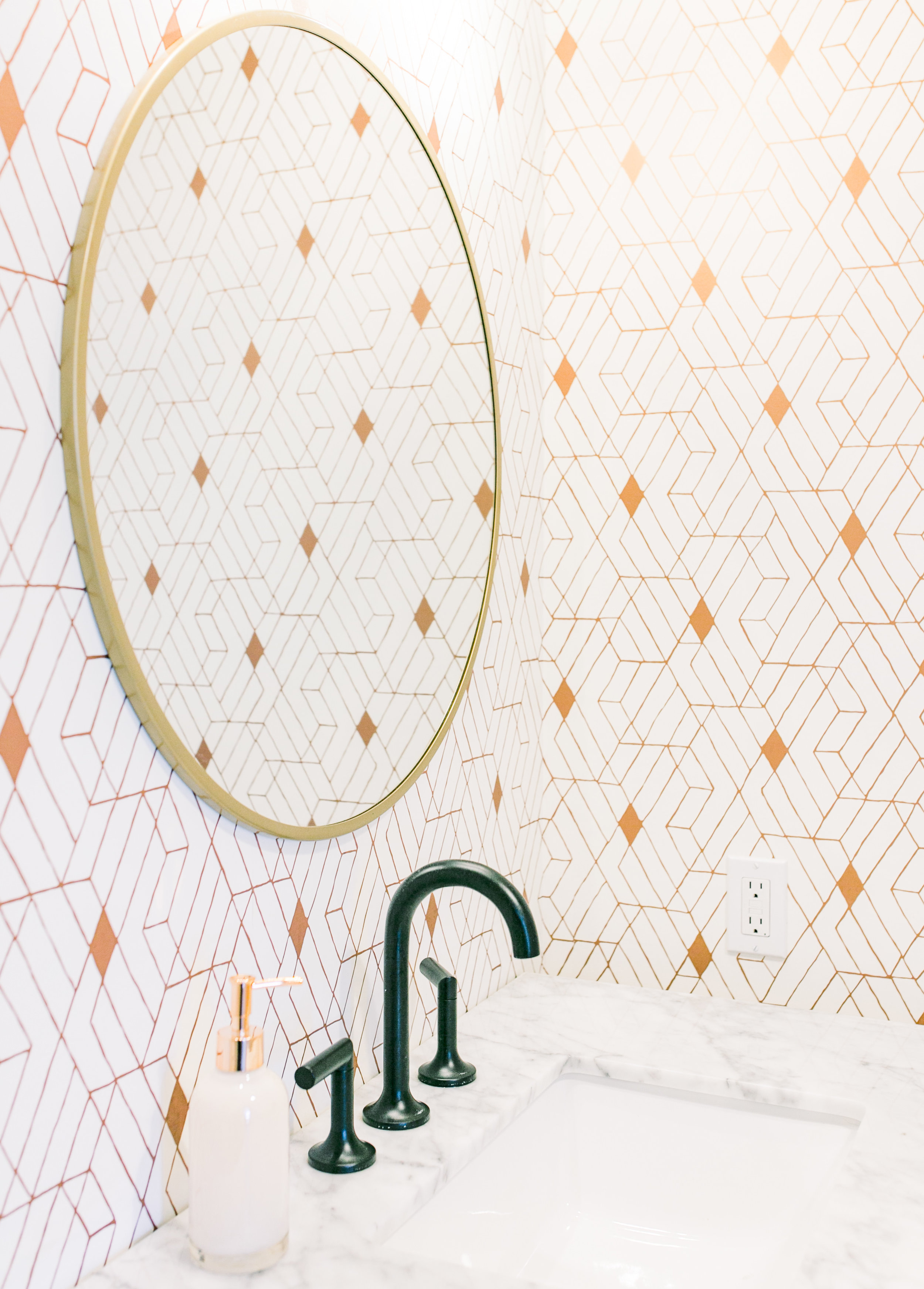
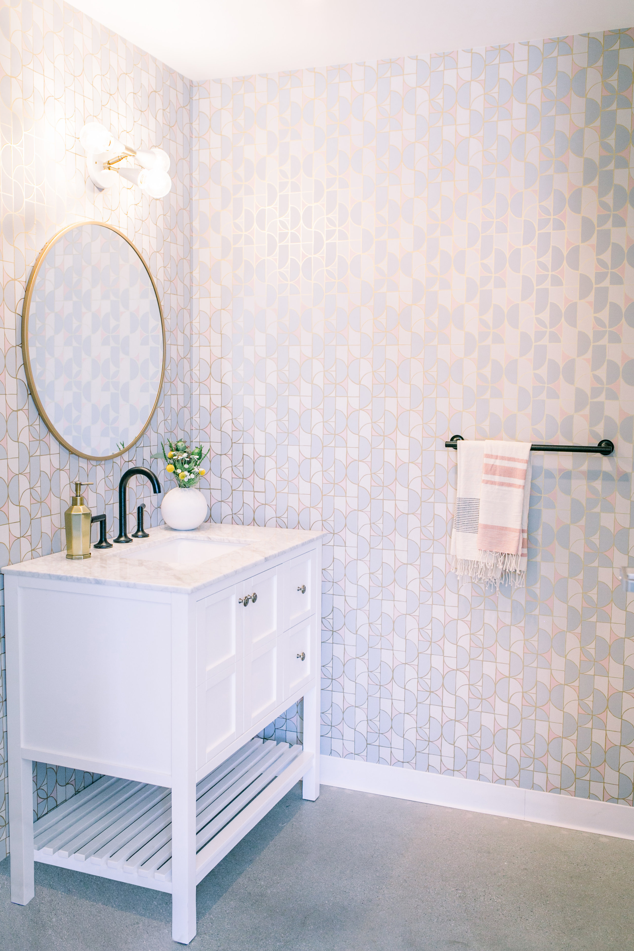
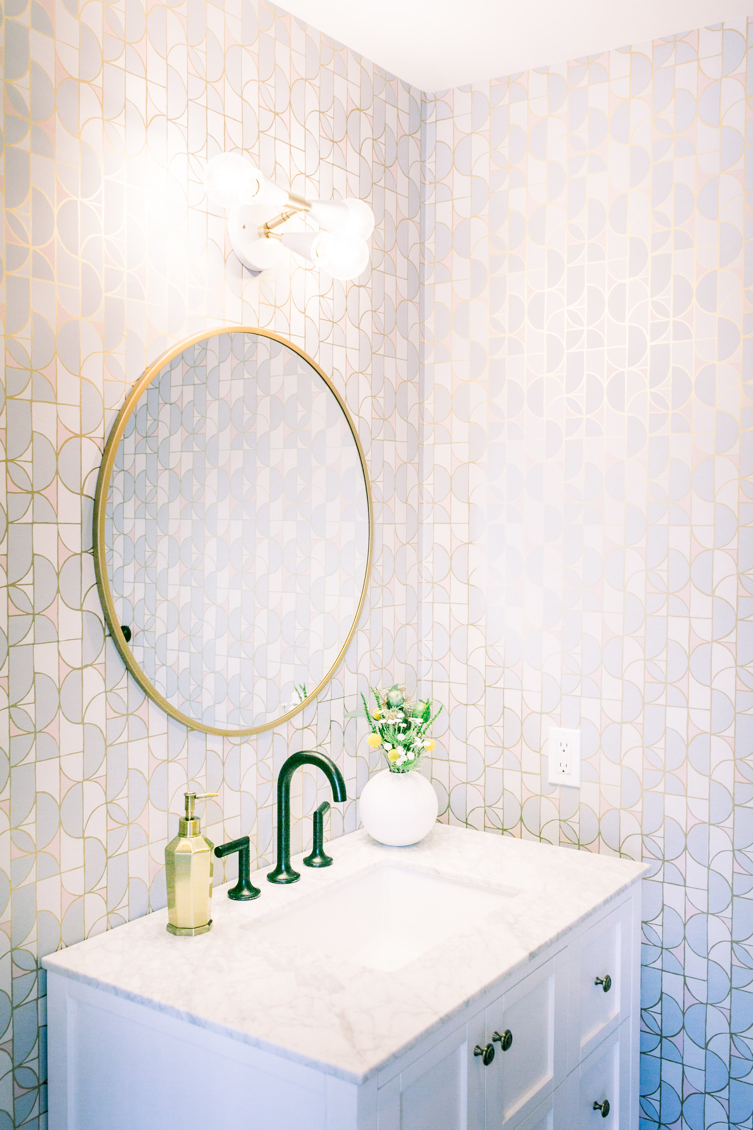
While there were no major structural changes to the space they did make some small updates to the bathrooms including replacing the vanities and adding patterned wallpaper in each room. “We also swapped out all the overhead lighting for more modern fixtures that worked with our design,” she adds.
Shop the Room:
Joss & Main Caldwell 36" Single Bathroom Vanity Set
eFaucets Brizo Jason Wu Two-Handle Bathroom Faucet
eFaucets Kohler Purist Towel Bar
e-Faucets Kohler Purist Wall Mount Pivoting Toilet Paper Holder
Project 62 Round Decorative Wall Mirror Brass
Cedar & Moss Terra Surface Flush Mount
CB2 Lyle Round Vase
While this project is definitely a slight departure from the typical Ginny Macdonald Design style she really reveled in the challenge. “Not a lot of clients are wanting too much color at the moment,” she says. “They’re veering towards the all-white and natural California look (which kinda drives me nuts and we have to work extra hard to persuade them to stretch their boundaries) so it was really refreshing to get to use actual color in a space.”
To end this spectacular office tour, we want to leave you with Macdonald’s best piece of advice that applies to both decorating and life. “Trust your gut and dare to break the rules,” she says. “I try not to follow suggested formulas when it comes to decorating otherwise things can end up boring and no one wants that.” We couldn’t agree more.
